Chapter 7 Global spatial autocorrelation
7.1 Cheat sheet
The following packages are required for this chapter:
require(sf)
require(spdep)
require(sp)
require(ncf)
require(tmap)
require(ggplot2)
require(ggpubr)
require(gstat) # for simulation of autocorrelated data
require(dplyr)
Important commands:
spdep::morancalculate Moran’s Ispdep::moran.test- parametric test for Moran’s Ispdep::moran.mc- permutation test for Moran’s Ispdep::EBImoran.mc- empirical Bayes modification of Moran’s Ispdep::lag.listw- computing a spatially lagged version of a variable vectorncf::correlog- correlogram (Moran’s I for different distance classes)
7.2 Spatial autocorrelation
Much classic statistical theory assumes that errors are independent and identically distributed (iid), often conforming to a Gaussian distribution. This simplifies equations since covariation terms can be set to zero. However, errors might be structured, violating the simplifying assumptions. Common reasons are:
- Hierarchical structure, e.g. by unaccounted effects of groups
- Temporal autocorrelation
- Spatial autocorrelation
If neighboring observations are more similar than those not neighboring this is called spatial autocorrelation. The relationship can be positive or negative. Positive spatial autocorrelation describes clustered data: both high values and low values cluster together. Negative autocorrelation describes regular pattern, such as a chessboard pattern: high values are surrounded by low values and low values by high values. For real world occurrence of negative spatial autocorrelation and implcations for analysis see e.g. (Griffith, 2019).
Presence of spatial autocorrelation has potentially severe consequences for most types of statistical analysis as it violates the common assumptions of independence of the error terms. Observed variance in the observations increases for positive spatial autocorrelation and decreases for negative spatial autocorrelation. Estimated standard errors are too small (or too big for negative sac) which effects p-values and thereby your decision if to reject a null hypothesis. This mixes up model selection procedures. Regression coefficients change in size and in rare cases even their sign might change. For correlation analysis this might increase or decrease correlation coefficients. Generally the sample sizes goes down for positive sac with effects on p-values.
Spatial autocorrelation might be present for different reasons:
Induced spatial dependence describes the situation there spatial autocorrelation is caused by a function dependency of the response on spatially structured predictors. An examle is the abundance or presence-absence of mosquito of Aedes type if the environmental factors relevant for their ecological niche (e.g. temperature, presence of standing water) are spatially structured. If a predictor with a spatial structure is missing this might lead to autocorrelation of regression residuals. A related situation occurs if the predictor is effecting the response at a different spatial scale - e.g. not just the census tract but also the neighboring census tracts are of relevance. This is often called a spill-over effect.
True autocorrelation is caused by a functional dependency between the response and adjacent response values, e.g. for infectious diseases. In other words the response is auto correlated. High infections at one location cause high infections nearby as the disease spreads. This could of course be moderated by covariates.
A third cause for spatial autocorrelation can be historical dynamics. Past events have led to a spatial structure that influences the response. For example noncommunicable diseases that are linked to socio-economic status of the population. The socio-economic status is often spatially clustered, frequently caused by past processes.
We cannot distinguish between the causes of spatial autocorrelation from the residuals. However, from a theoretical perspective we might be able to develop a hypothesis on the reason for the presence of spatial autocorrelation.
7.3 Global Moran’s I
The global Moran’s I as a measure of global spatial autocorrelation.
\[I = \frac{n}{S_0} \frac{\sum_i^n \sum_j^n w_{ij} (x_i - \bar{x}) (x_j - \bar{x}) } {\sum_i (x_i - \bar{x})^2}\]
With \(i\) and \(j\) indices of the districts, \(S_0\) the global sum of the weights in weight matrix \(W\) and \(w_{ij}\) elements of \(W\). \(n\) is the total number of spatial units in the data set.
\[ S_0 = \sum_i \sum_j w_{ij}\]
The underlying concept is to check if all observations in a neighborhood have the same or the opposite sign. If the values two observations in a neighborhood are larger than the global mean the term \((x_i - \bar{x}) (x_j - \bar{x})\) will be positive. The same is true if the values of two observations in a neighborhood are smaller than the global mean (minus times minus results in plus). If the value of one observation in a pair in a neighborhood is larger and the second smaller than the global mean this results in a negative value for \((x_i - \bar{x}) (x_j - \bar{x})\). As negative and positive values of \((x_i - \bar{x}) (x_j - \bar{x})\) cancel out when summing for all observation Moran’s I is around zero if the values are spatially independent. If large values tend to cluster together and small values tend to cluster together this results in a positive value of Moran’s I (indicator for positive spatial autocorrelation, clustered). If small values are always neighbored by large values this will result in a negative value for Moran’s I (indicator for negative spatial autocorrelation, regular pattern).
The range of Moran’s I depends on the largest and smallest largest eigenvalue of the weight matrix \(W\) (De Jong et al., 1984). Often the interval is in the range -0.5 to 1.15. However, smaller and larger values are possible for different spatial arrangements. Compare the section about spatial eigenvector mapping .
The expected value under the null hypothesis of no spatial autocorrelation is close to zero (\(- \frac{1}{N-1}\)). Significance can be tested based based on a parametric test. This test relies however on the large sample assumption which are not always fulfilled. Another critical assumption is that \(W\) is symmetric. As in many cases a permutation test is an alternative. The test compares the observed Moran’s I value with Moran’s I value we get if we randomly assign the present values of interest to the given locations. If spatial association would not matter, the observed Moran’s I should not be very different from the distribution of I values from the permuted data. By comparing the observed Moran’s I with the distribution of Moran’s I values we get from the permutation we can derive a p-value. The p-value basically is the position of the observed Moran’s I if all simulated Moran’s I values and the observed Moran’s I value are ordered. The permutation test is generally preferred but is of course more time demanding, depending on the number of simulations. A number of simulations of 499 or 999 should be used as the lower limit.
Moran’s I can be misleading in presence of a spatial trend (see the examples below) as well as if the variance of the expected value varies in space (instationarity). A spatial varying variance of the expected value is common if we look at a rate there the underlying populations is varying in space.
If Moran’s I is calculated for a row-standardized spatial weight matrix \(W\), the equation can be rewritten as follows:
\[ I = \frac{\sum_i^n \sum_j^n w_{ij} (x_i - \bar{x}) (x_j - \bar{x}) } {\sum_i^n (x_i - \bar{x})^2}\]
If we rewrite that using the concept of the spatial lag we get a form that resembles Pearsons correlation coefficient:
\[ \tilde{x}_i = \sum_j w_{ij}x_j\] \[ I = \frac{\sum_i^n (x_i - \bar{x}) (\tilde{x}_i - \bar{x}) } {\sum_i^n (x_i - \bar{x})^2} = \frac{\sum_i^n (x_i - \bar{x}) (\tilde{x}_i - \bar{x}) } {\sqrt{\sum_i^n (x_i - \bar{x})^2 \sum_i^n (x_i - \bar{x})^2}}\]
This shows similarities to Pearson’s r:
\[r_{x,y} = \frac{\sum_i^n (x_i - \bar{x}) (y_i - \bar{x}) } {\sqrt{\sum_i^n (x_i - \bar{x})^2 \sum_i^n (y_i - \bar{y})^2}} \]
Moran’s I and tests can be calculated by functions provided in spdep:
- moran calculate Moran’s I
- moran.test - parametric test
- moran.mc - permutation test
7.3.1 Empirical Bayes index modification
For count data - such as covid-19 cases or the number of tweets that contains a specific keyword - with a varying population - different population living in the different districts, different total number of tweets per spatial unit - we should not trust the normal Moran’s I. If the population in a spatial unit is small, a rare event will have a large effect on the rate. For districts with a large population it is much more unlikely to observe a rare event.
This is handled by the empirical index modification of Moran’s I [assuncao_new_1999].
The statistic used in the empirical index modification of Moran’s I is:
\[EBI = \frac{n}{S0} \frac{ \sum_i \sum_j w_{ij} z_i z_j} { \sum_i (z_i - \bar{z})^2}\]
- \(m\) is the number of observations
- \(n\) the number of cases (observed events)
- \(x\) the population
- \(S0 = \sum_i \sum_j w_{ij}\) the sum of the weights
- \(z_i = (p_i - b) / \sqrt(v_i)\) - the deviation of the estimated marginal mean standardized by an estimate of its standard deviation (z-score transformation)
- \(p_i = n_i / x_i\) - the estimated rate
- \(v_i = a + (b / x_i)\) - the marginal variance of \(p_i\)
- \(a = s^2 - b / (\sum_i x_i / m)\)
- \(s^2 = \sum_i x_i (p_i - b)^2 / \sum_i x_i\)
- \(b\) is the marginal expectation of \(p_i\)
The underlying idea is to assume that the rate has an expected value of \(b\) and a variance of \(v\).
The permutation test is based on an permutation of the vector \((z_1, z_2, ..., z_n)\). For each permuted map EBI is calculated and stored. Finally, the observed EBI is compared against vector of EBIs for the permutation to derive the p-value.
This is done by EBImoran.mc in the spdep package.
7.3.2 Calculating Moran’s I for different distance classes - the correlogram
If we calculate Moran’s I (or another indicator of global spatial autocorrelation) for varying distance classes we get a plot of autocorrelation against distance. Such plots can be used to investigate the correlation length: how far reaches the autocorrelation before the effect levels of? The distance classes are not overlapping. To test if the spatial autocorrelation is higher than the value to expected at random we can use permutation tests.
The functionality is provided by correlog in the ncf package.
sp.correlogram allows to calculate a correlogram that does not plot Moran’s I (or Gerry’s C) against distance but against different orders of neighborhood (neighbor of neighbors would be order 2, neighbors of neighbor of neighbors order 3)
7.3.3 The Moran scatterplot
Another way at looking at the data is by means of the Moran scatterplot (moran.plot) which plots the value of each observation against the lagged value (if \(W\) is row-standardized the weighted mean of its neighbors) (Anselin, 1996). This allows to distinguish between different behavior in the data. While some data might be positively autocorrelated others might be not correlated or negatively correlated.
The slope of regression line drawn on the values versus lagged values represents the unstandardized global Moran’s I value (cf. figure 7.12).
Figure 7.1: Examples of the Moran scatterplot for simulated data. Rho is a measure of spatial autocorrelation, cf. the spatial error model. As the data are simulated the slope might indicate the wrong direction (non significant) for low values of rho.
7.4 Geary’s C
An alternative to Moran’s I is Gerry’s C which does not take the difference from the global mean but looks at the squared differences between neighboring observations.
\[ C = \frac{n-1}{2 \sum_i^n \sum_j^n w_{ij} } \frac{\sum_i^n \sum_j^n w_{ij} (x_i - x_j)^2}{ \sum_i^n(x -\bar{x})^2}\]
Geary’s C range typically from 0 (highest positive autocorrelation) to 2 (highest negative spatial autocorrelation). The expected value is 1 (no autocorrelation). Values higher than 2 are possible especially for situations with only a few distance pairs. Skewed data can bias Geary’s C due to the squared difference which is sensitive to outliers. Also, Geary’ s C (sometimes also called Geary’s ratio) is more sensitive to spatial units with many neighbors (Griffith and Chun, 2022).
The main difference compared to Moran’s I is that Geary’s C is based on the squared difference in value between two neighboring observations \((x_i - x_j)^2\). If the difference for many neighboring pairs is small (large values surrounded by large values, small values surrounded by small values) Geary’s C will be close to zero. If the difference is large (large values neighboring small values) this will influence the result strongly as the difference is squared.
Geary’s C can be rewritten as a function that includes Moran’s I (often also called Moran coefficient (MC)) (Griffith and Chun, 2022):
\[GC = \frac{n-1} {\sum_{i=1}^n \sum_{j=1}^nw_{ij}} \frac{\sum_{i=1}^n [(\sum_{j=1}w_{ij})(x_i-\bar{x})^2]} {\sum_{i=1}^n(x_i-\bar{x})^2} - \frac{n-1} {n} \cdot MI\]
An interesting property is that \(MI+GC \approx 1\)
Significance testing can be based on a normal approximation or on a permutation test. The normal approximation test assumes a symmetric relationship and is less sensitive to violations of this assumption than the test for Moran’s I.
Moran’s I gives a more global indicator, whereas Geary’s C is more sensitive to differences in small neighborhoods. For normal connectivity settings (with respect to the number of neighbors) Moran’s I is more powerful to detect positive spatial autocorrelation while Geary’s C is more powerful in detecting negative spatial autocorrelation (Griffith and Chun, 2022). If the number of neighbors goes up, Geary’s C becomes more powerful for the detection of both positive and negative spatial autocorrelation (Griffith and Chun, 2022).
It is calculated with geary, geary.test and geary.mc in spdep similar to moran.
7.5 Getis-Ord G
A third measure of global spatial autocorrelation is Getis-Ord’s G (Getis and Ord, 2010):
\[ G =\frac{ \sum_i^n \sum_{j, j \neq i}^n w_{ij} x_i x_j }{\sum_i^n \sum_{j, j \neq i}^n x_i x_j} \]
The measure is only applicable for positive values - and therefore explicitly not useful for the analysis of regression residuals. For the same reason it is not applicable for z-scores returned by EBI - as z-scores by definition include negative values.
As it is hard to compare Geti’s G values across different data sets usual z-scores are considered.
\[ z_G = \frac{G - E[G]} {\sqrt{V[G]}} \]
with the expected value:
\[ E[G] = \frac{\sum_i^n \sum_{j, j \neq i}^n w_{ij}}{n(n-1)} \] and the variance: \[ V[G] = E[G^2] - E[G]^2 \]
The formula for \(E[G^2]\) is intemidatingly complex, therefore we skip it here.
If high values cluster spatially Geti’s G will be high (hotspots) and if low values are frequently neighboring each other Geti’s G will be low (coldspot). G is high where the sum of values within a neighborhood of a given radius or configuration is high relative to the global average and negative where the sum of values within a neighborhood are small relative to the global average and approaches 0 at intermediate values.
For Moran’s I or Geary’s C it makes no difference if only high values or low values would cluster. For Geti-Ord G this would make a clear difference in the results.
Getis-Ord G is calculated by spdep::globalG.test. The function reports the observed global G value, the expected value and the variance of the estimation. As the statistic it reports how many standard deviations the observed G value is away from the expected value and the associated p-value for \(H_0\) that there is no difference between the observed and the expected global G value.
7.6 Effects of spatial autocorrelation on random variables
What is the effect of spatial autocorrelation on the spread of a variable? To test this we will simulate a sample without spatial autocorrelation and induce positive (gaussian) spatial autocorrelation to it. We will do that for the three most common distributions: gaussian, Poisson and binomial.
## Loading required package: fields## Loading required package: spam## Spam version 2.11-0 (2024-10-03) is loaded.
## Type 'help( Spam)' or 'demo( spam)' for a short introduction
## and overview of this package.
## Help for individual functions is also obtained by adding the
## suffix '.spam' to the function name, e.g. 'help( chol.spam)'.##
## Attaching package: 'spam'## The following objects are masked from 'package:base':
##
## backsolve, forwardsolve## Loading required package: viridisLite##
## Try help(fields) to get started.For the gaussian example we see that while the mean is relatively similar, the variance increased if positive spatial autocorrelation is added to the simulated data (red histogram). In this case the mean is slightly for the autocorrelated case but this is by chance. Repeating the experiment with a different random seed will likely give us a different pattern. On average the mean wil be quite similar.
For the Poisson distribution we see again that the positive spatial autocorrelation leads to an increase in variance: more zeros, more higher values.
For the binomial sample we see an increase in the extreme (all or nothing) cases
7.6.1 Repeated sampling with and without spatial autocorrelation
We have looked at a single example. As this is driven by chance we will repeat the procedure a thousand times and sample repeatedly. We wll always store the statistics (mean, variance, skewness, kurtosis) of the sample with and without spatial autocorrelation and plot their distribution.
n <- 10^4
res <- data.frame(gausMean=rep(NA, n), gausSd=NA, gausSkewness=NA, gausKurtosis=NA,
                  poisMean=NA, poisSd=NA, poisSkewness=NA, poisKurtosis=NA,
                  binomMean=NA, binomSd=NA, binomSkewness=NA, binomKurtosis=NA,
                  gausMeanNoSp=rep(NA, n), gausSdNoSp=NA, gausSkewnessNoSp=NA, gausKurtosisNoSp=NA,
                  poisMeanNoSp=NA, poisSdNoSp=NA, poisSkewnessNoSp=NA, poisKurtosisNoSp=NA,
                  binomMeanNoSp=NA, binomSdNoSp=NA, binomSkewnessNoSp=NA, binomKurtosisNoSp=NA)
lambda <-3
prob <- .4
sizeBinom <- 3
for(i in 1:n)
{
  # create an autocorrelated random field
 GausNoSp <- rnorm(dim(distM)[1], mean = lambda)
PoisNoSp <- rpois(dim(distM)[1], lambda= lambda)
BinomNoSp <- rbinom(dim(distM)[1], size=sizeBinom, prob= prob)  / sizeBinom

errorGaus <- weights_inv %*% rnorm(dim(distM)[1])

GausSp <- GausNoSp + errorGaus
PoisSp <- round(PoisNoSp + sqrt(PoisNoSp)*errorGaus)
PoisSp <- ifelse(PoisSp< 0, 0, PoisSp )
BinomSp <- BinomNoSp + sqrt(BinomNoSp*(1-BinomNoSp))*errorGaus
BinomSp <- ifelse(BinomSp < .5,0, 1)

  res$gausMean[i] <- mean(GausSp)
  res$gausSd[i] <- sd(GausSp)
  res$gausSkewness[i] <- moments::skewness(GausSp)
  res$gausKurtosis[i] <- moments::kurtosis(GausSp)

  res$poisMean[i] <- mean(PoisSp)
  res$poisSd[i] <- sd(PoisSp)
  res$poisSkewness[i] <- moments::skewness(PoisSp)
  res$poisKurtosis[i] <- moments::kurtosis(PoisSp)

  res$binomMean[i] <- mean(BinomSp)
  res$binomSd[i] <- sd(BinomSp)
  res$binomSkewness[i] <- moments::skewness(BinomSp)
  res$binomKurtosis[i] <- moments::kurtosis(BinomSp)

  # non spatial
  res$gausMeanNoSp[i] <- mean(GausNoSp)
  res$gausSdNoSp[i] <- sd(GausNoSp)
  res$gausSkewnessNoSp[i] <- moments::skewness(GausNoSp)
  res$gausKurtosisNoSp[i] <- moments::kurtosis(GausNoSp)

  res$poisMeanNoSp[i] <- mean(PoisNoSp)
  res$poisSdNoSp[i] <- sd(PoisNoSp)
  res$poisSkewnessNoSp[i] <- moments::skewness(PoisNoSp)
  res$poisKurtosisNoSp[i] <- moments::kurtosis(PoisNoSp)

  res$binomMeanNoSp[i] <- mean(BinomNoSp)
  res$binomSdNoSp[i] <- sd(BinomNoSp)
  res$binomSkewnessNoSp[i] <- moments::skewness(BinomNoSp)
  res$binomKurtosisNoSp[i] <- moments::kurtosis(BinomNoSp)

}
7.6.1.1 Gaussian
Mean of the mean and the standard deviation (across samples) for the spatially auto-correlated and the normal case
## [1] 0.6283741## [1] 0.05038497## [1] 2.998432## [1] 3.000631## [1] 1.263044## [1] 0.9993492Standard deviation of the mean (across samples) for the spatially auto-correlated and the normal case
## [1] 0.6283741## [1] 0.05038497Skewness of the mean (across samples) for the spatially auto-correlated and the normal case
## [1] -0.04213075## [1] 0.02692453Kurtosis of the mean (across samples) for the spatially auto-correlated and the normal case
## [1] 2.937442## [1] 3.099831The spread of the mean is much higher for the spatial autocorrelated cases ()
ggplot(res, aes(x=gausMean)) + geom_histogram(binwidth=0.05, bg="red", alpha = .5) +
  geom_histogram(aes(x=gausMeanNoSp), bg="navy", alpha=.5, binwidth=0.05) +
  labs(title="Gaussian, mean") + xlab("mean")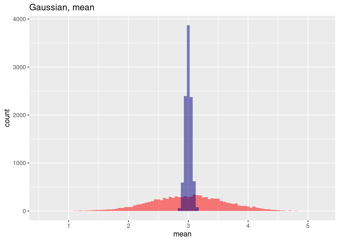
The variance for the spatial case (red) is much higher.
ggplot(res, aes(x=gausSd)) + geom_histogram(binwidth=0.01, bg="red", alpha=.5) +
  geom_histogram(aes(x=gausSdNoSp), bg="navy", alpha=.5, binwidth=0.01) +
  labs(title="Gaussian, sd") + xlab("sd")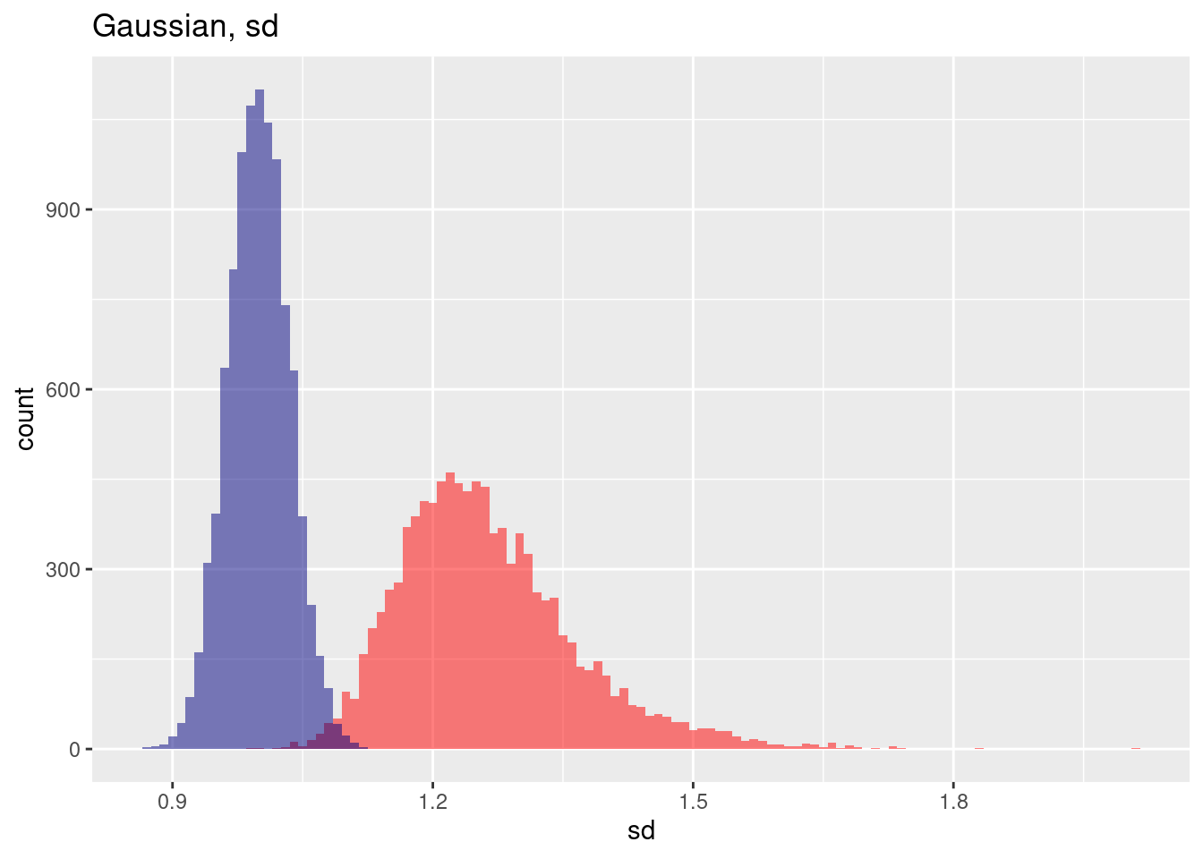
The skewenss for the positive autocorrelated case (red) is a bit higher.
ggplot(res, aes(x=gausSkewness)) + geom_histogram(binwidth=0.01, bg="red", alpha=.5) +
  geom_histogram(aes(x=gausSkewnessNoSp), bg="navy", alpha=.5, binwidth=0.01) +
  labs(title="Gaussian, skewness") + xlab("skewness")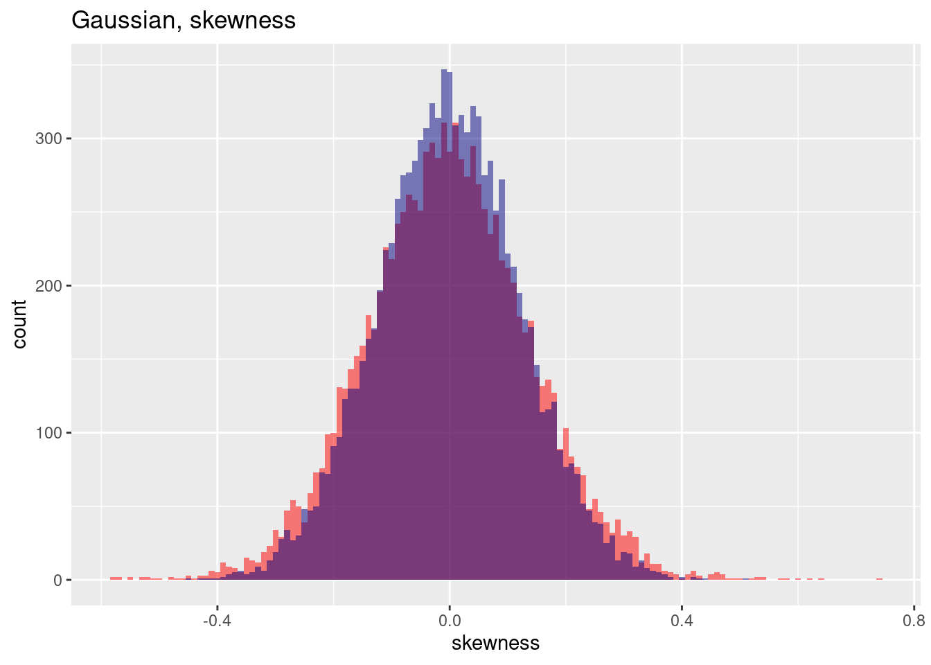
ggplot(res, aes(x=gausKurtosis)) + geom_histogram(binwidth=0.01, bg="red", alpha=.5) +
  geom_histogram(aes(x=gausKurtosisNoSp), bg="navy", alpha=.5, binwidth=0.01) + labs(title="Gaussian, kurtosis") + xlab("kurtosis")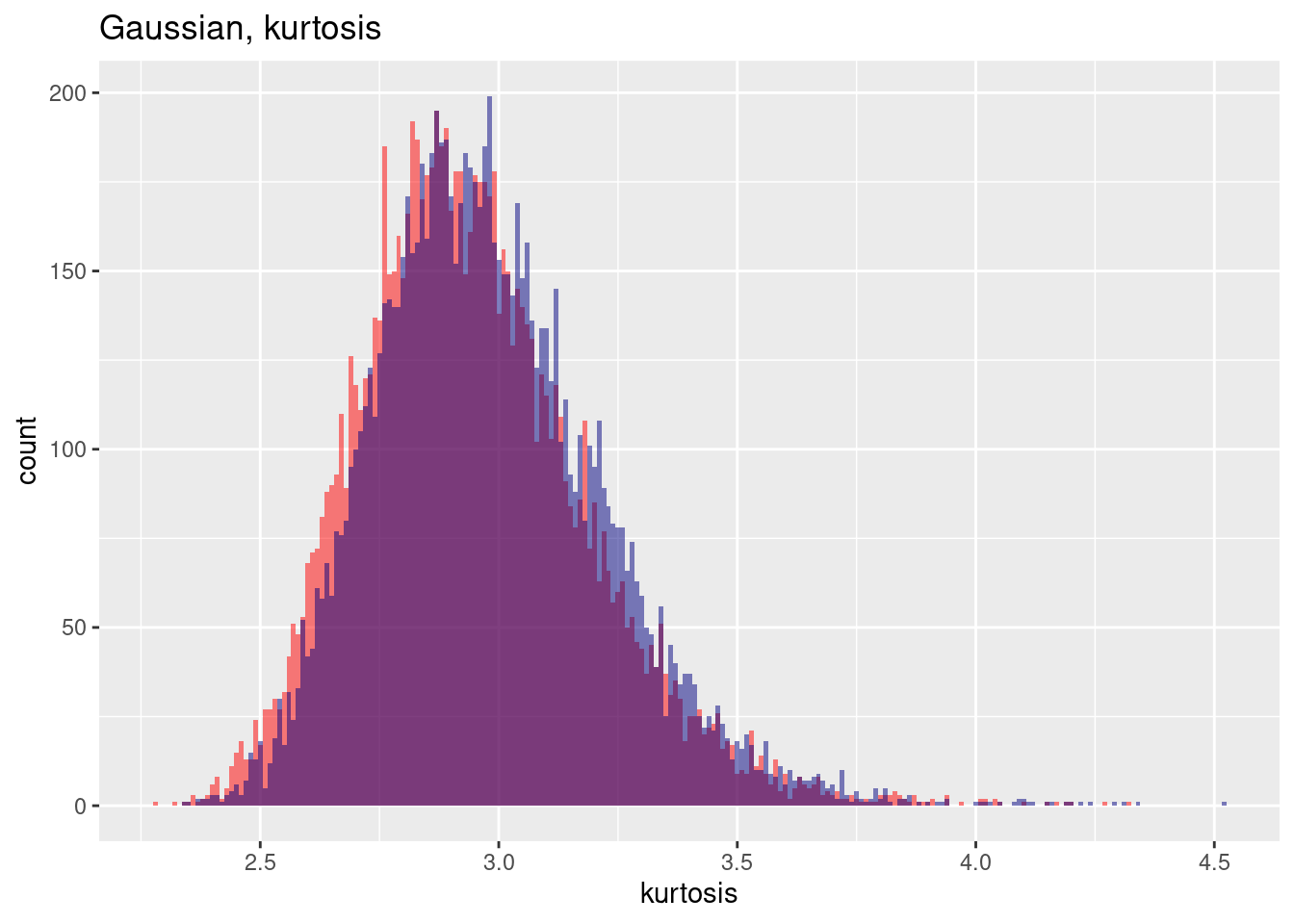
7.6.1.2 Poisson
For a Poisson distribution the effect of including spatial autocorrelation leads also to an increase in variance (without spatial autocorrelation the mean estimated standard deviation across the samples in the example is: 1.7309452, with spatial autocorrelation the estimated standard deviation across the sample increases to 2.1807364) while the estimation of the mean across the samples is only marginally affected (without spatial autocorrelation 3.0005962, with spatial autocorrelation: 3.028668).
## [1] 3.028668## [1] 3.000596## [1] 2.180736## [1] 1.730945This is clearly visible in the histogram of the estimated means across the 10,000 samples: while the mean of the means are very similar, the variance for the spatially autocorrelated case is much wider.
ggplot(res, aes(x=poisMean)) + geom_histogram(binwidth=.01, bg="red", alpha=.5) +
  geom_vline(xintercept = mean(res$poisMean), col= "red", lty=2) +
  geom_histogram(aes(x=poisMeanNoSp), bg="navy", alpha=.5, binwidth=0.01) +
  geom_vline(xintercept = mean(res$poisMeanNoSp), col= "navy", lty=2) +
  labs(title="Estimation of the mean from a Poisson sample",
       subtitle = "With and without spatial autocorrelation, 10,000 samples") + xlab("Estimated mean for each sample") +
  annotate(geom= "label", x=4.3, y=200, label="Without spatial autocorrelation", col="navy") +
  annotate(geom= "label", x=1.5, y=70, label="With spatial autocorrelation", col="red")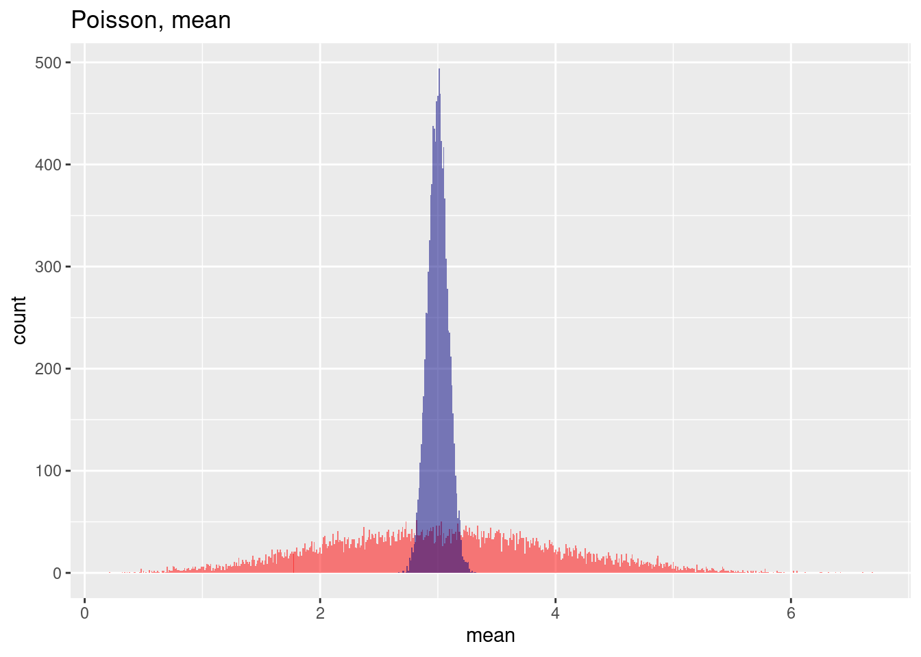
The estimation of the standard deviation across the 10,000 samples in the spatially autocorrelated case suffers not only from increases variability but also from a bias.
ggplot(res, aes(x=poisSd)) + geom_histogram(binwidth=.01, bg="red", alpha=.5) +
  geom_vline(xintercept = mean(res$poisSd), col= "red", lty=2) +
  geom_histogram(aes(x=poisSdNoSp), bg="navy", alpha=.5, binwidth=.01) +
  geom_vline(xintercept = mean(res$poisSdNoSp), col= "navy", lty=2) +
  labs(title="Estimation of the mean from a Poisson sample",
       subtitle = "With and without spatial autocorrelation, 10,000 samples") + xlab("Estimated st.dev. for each sample") +
  annotate(geom= "label", x=1.25, y=200, label="Without spatial\nautocorrelation", col="navy") +
  annotate(geom= "label", x=3, y=90, label="With spatial autocorrelation", col="red")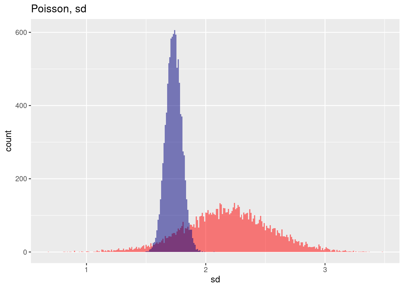
7.6.1.3 Bernoulli (p=.5)
Looking at a Bernoulli Distribution with p=0.5 we see as well that the mean of the sample means across the 10,000 samples is only biased only a bit if spatial autocorrelation is included while the variance across the means is strongly inflated.
cat(paste("mean without: ", mean(res$binomMean) %>% round(4),
          ", mean with spatial autocorrelation: ",mean(res$binomMeanNoSp) %>% round(4), "\n"))
## mean without: 0.404 , mean with spatial autocorrelation: 0.4cat(paste("sd without: ", mean(res$binomSd) %>% round(4),
", sd with spatial autocorrelation: ",mean(res$binomSdNoSp) %>% round(4), "\n"))## sd without: 0.4558 , sd with spatial autocorrelation: 0.2827The histogram of mean estimations across the 10,000 samples shows both the small bias and the heavy increase in variability for the spatially autocorrelated case.
ggplot(res, aes(x=binomMean)) + geom_histogram(binwidth=.01, bg="red", alpha=.5) +
  geom_vline(xintercept = mean(res$binomMean), col= "red", lty=2) +
  geom_histogram(aes(x=binomMeanNoSp), bg="navy", alpha=.5, binwidth=.01) +
  geom_vline(xintercept = mean(res$binomMeanNoSp), col= "navy", lty=2) +
  labs(title="Estimation of the mean from a Bernoulli (p=0.5) sample",
       subtitle = "With and without spatial autocorrelation, 10,000 samples") + xlab("Estimated mean for each sample") +
  annotate(geom= "label", x=.23, y=1200, label="Without spatial autocorrelation", col="navy") +
  annotate(geom= "label", x=.6, y=350, label="With spatial autocorrelation", col="red")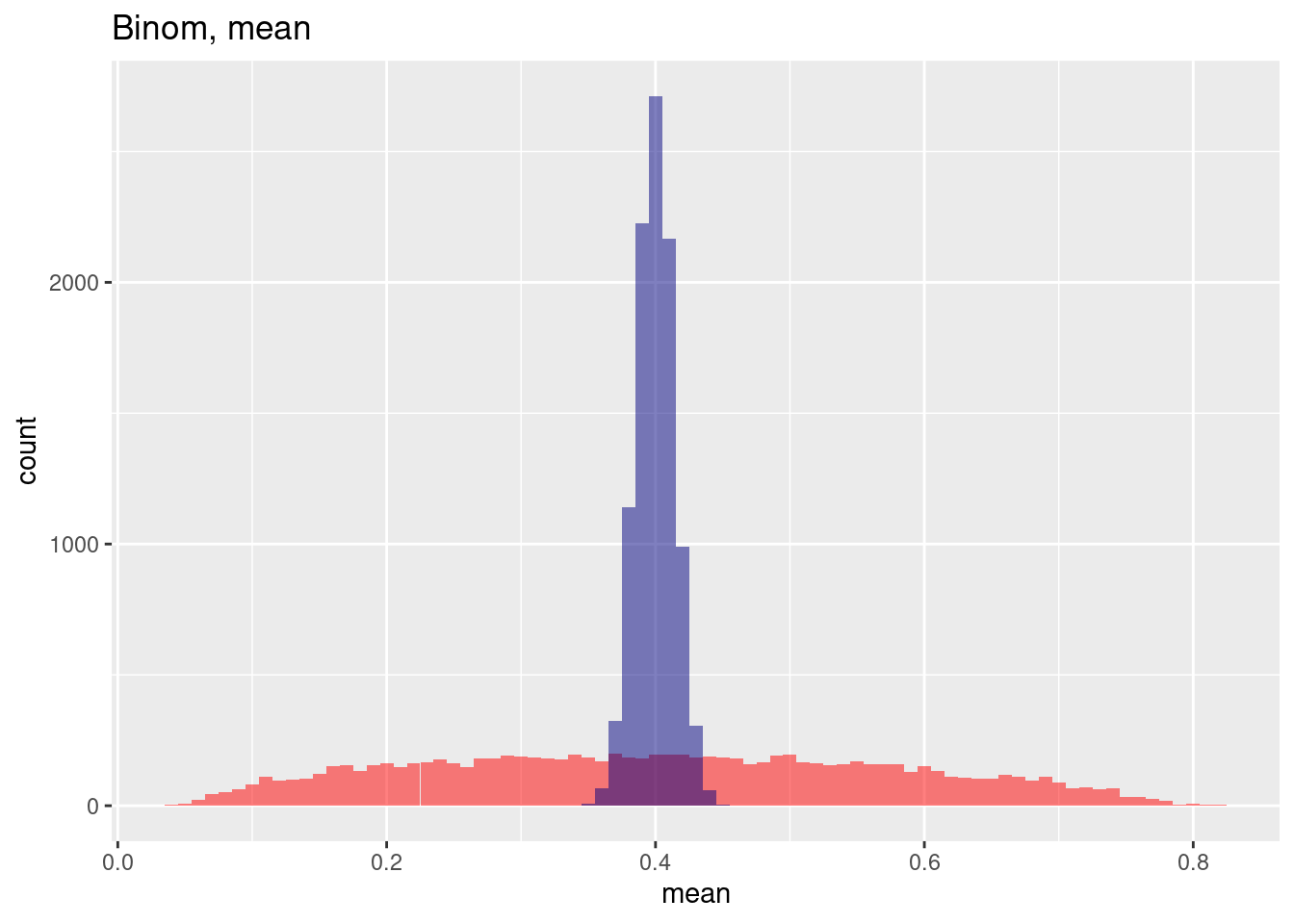
We observe that the histogram of the standard deviation for each individual sample is also heavily skewed for the spatially auto correlated case while the histogram for the situation without spatial autocorrelation looks more or less unskewed in comparison. In addition we see the big bias and the heay increase in standard deviation for th spatially autocorrelated case.
ggplot(res, aes(x=binomSd)) + geom_histogram(binwidth=.005, bg="red", alpha=.5) +
  geom_vline(xintercept = mean(res$binomSd), col= "red", lty=2) +
  geom_histogram(aes(x=binomSdNoSp), bg="navy", alpha=.5, binwidth=.005) +
  geom_vline(xintercept = mean(res$binomSdNoSp), col= "navy", lty=2) +
  labs(title="Estimation of the mean from a Bernoulli (p=0.5) sample",
       subtitle = "With and without spatial autocorrelation, 10,000 samples") + xlab("Estimated st.dev. for each sample")  +
  annotate(geom= "label", x=.31, y=2000, label="Without spatial autocorrelation", col="navy") +
annotate(geom= "label", x=.43, y=700, label="With spatial autocorrelation", col="red") 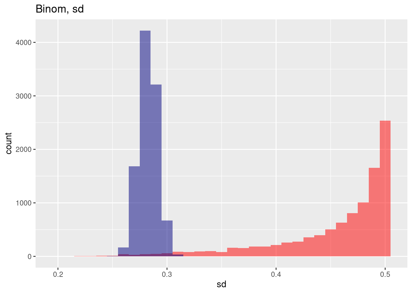
7.7 Simulated data as a case study
7.7.1 Positive autocorrelation
To demonstrate the use of the approaches we will start with simple gridded data that have been simulated. Autocorrelation has been created by defining a variogram and unconditional simulation (see kriging section). It is not of importance that you understand the simulation code.
In essence: we create a regular grid, define a functional relationship and use that to simulate autocorrelated data. The function used takes three parameters (see kriging theory section): the functional type, the range (at which distance does spatial autocorrelation level of) and the (partial) sill: the semi-variance at the range. Higher values for the partial sill indicate (ceteris paribus) that the autocorrelation function drops faster.
# function for the simulation of positively autocorrelated data
# based on a regular grid and a variogram model
simPosSAC <- function(gridDim=60, varioMod = vgm(psill=0.05, range=10, model='Exp'))
{
  xy <- expand.grid(x=1:gridDim, y=1:gridDim)


  # Set up an additional variable from simple kriging
  zDummy <- gstat(formula=z~1, locations = ~x+y, dummy=TRUE,
                  beta=1, model=varioMod, nmax=20)

  # Generate  randomly autocorrelated data fields
  xyz <- predict(zDummy, newdata=xy, nsim=1)

  # convert those into an sf polygon data set
  spGridded <- xyz
  gridded(spGridded) = ~x+y

  sim1Sf <- as(spGridded, "SpatialPolygonsDataFrame") %>% st_as_sf()

  return(sim1Sf)
}## [using unconditional Gaussian simulation]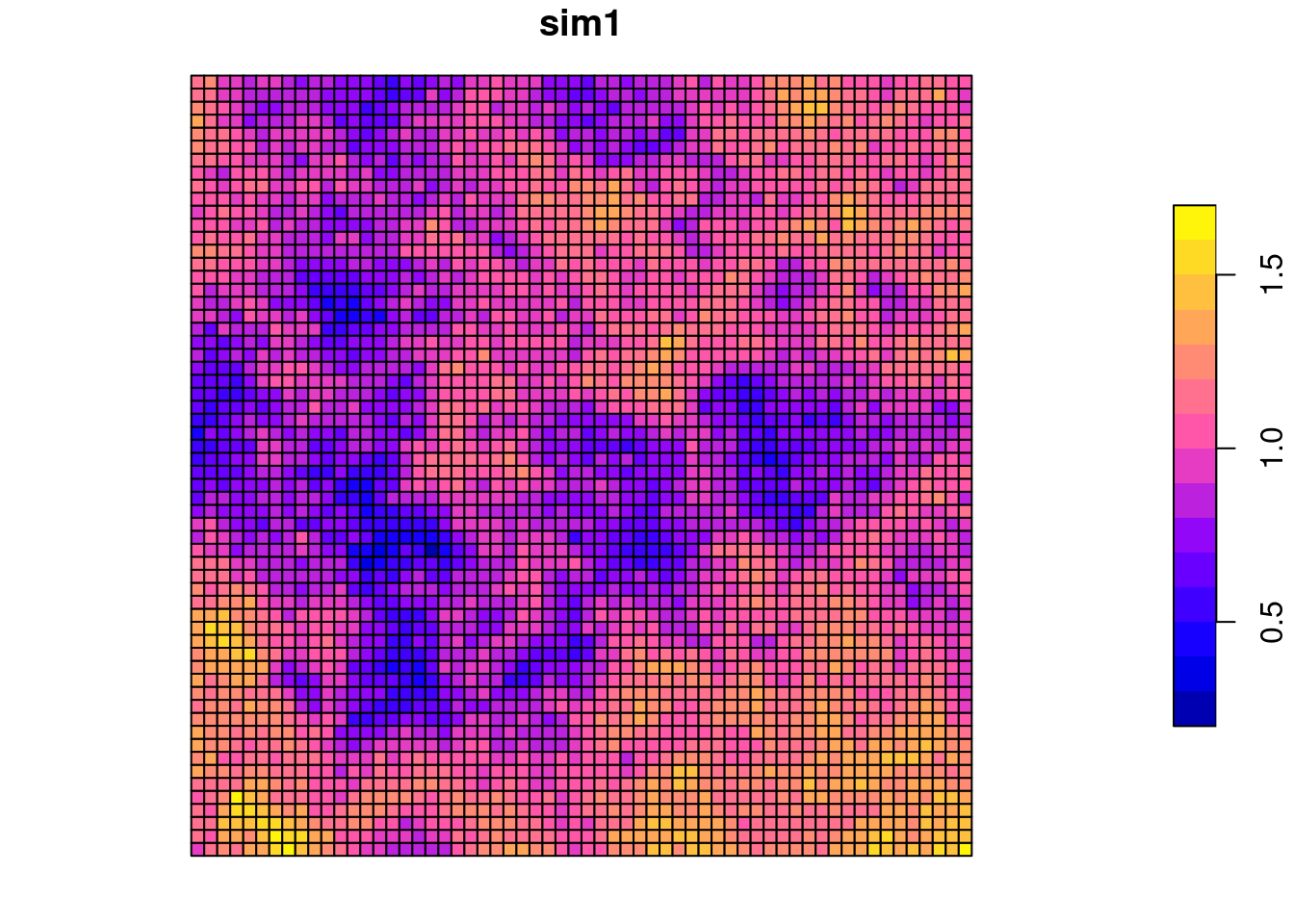
For raster based data a contiguity neighborhood definition (do polygons share an edge or a node?) seems natural. We create a queen contiguity based neighborhood, use row-standardized weighting and calculate Moran’s I together with a parametric test.
sim1_polynb <- poly2nb(sim1Sf)
sim1_polynb_lw <- nb2listw(sim1_polynb, style = "W")
moran.test(x = sim1Sf$sim1, listw = sim1_polynb_lw)
##
## Moran I test under randomisation
##
## data: sim1Sf$sim1
## weights: sim1_polynb_lw
##
## Moran I statistic standard deviate = 102.35, p-value < 2.2e-16
## alternative hypothesis: greater
## sample estimates:
## Moran I statistic Expectation Variance
## 8.668684e-01 -2.778550e-04 7.178553e-05The data is clearly (p-value) and strongly (Moran’s I statistic) positively autocorreltated, i.e. clustered.
How does the autocorrelation change with distance between neighbors? We use the correlog function from ncf. It needs the coordinates and the variable of interest (we have only one). We first get the centroids of the polygons of the polygon-raster, then the coordinates and convert them to a data frame. For correlog we need to specify the increment (the number of map units that is used as a distance band) and the number of resamplings required. Hint: for real data in projected coordinate system it is essential to use a big enough increment. If you have data that span hundreds of kilometers an increment of 10 would mean that you ask R to perform a calculation for each 10m distance band - that does not deliver very useful results and will take forever. Resampling is good but takes time. If one sample takes 10 seconds, 1000 samples will take 10*1000 seconds. Good for real research but not necessary for class exercises in most cases if the number of observations is big.
## Warning: st_centroid assumes attributes are constant over geometriesThe function returns an object with a number of fields that can be used for plotting: - correlation, the value for the Moran (or Mantel) similarity - mean.of.class, the actual average of the distances within each distance class. - n, the number of pairs within each distance class.
sim1CorlogDf <- data.frame(n = sim1Corlog$n,
           mean.of.class = sim1Corlog$mean.of.class,
           correlation = sim1Corlog$correlation)

ggplot(data = sim1CorlogDf, mapping = aes(x=mean.of.class, y= correlation, size = n)) +
  geom_point(alpha=.5) +
  geom_line(mapping = aes(x=mean.of.class, y= correlation), inherit.aes =FALSE) +
  scale_size_binned_area(name="# distance pairs") +
  geom_hline(yintercept = 0) +
  xlab("Mean distance") +
ylab("Moran's I") 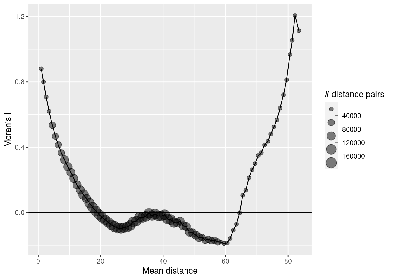
As we see we have positive autocorrelation at short distances that become negative (non-significant I assume) after 20 map units. The increase in autocorrelation for large distances is an artefact, caused by the few distance pairs in these distance bands. It is good practice to ignore those and not even plot those.
ggplot(data = sim1CorlogDf %>% filter(mean.of.class < 2/3 * max(mean.of.class)), mapping = aes(x=mean.of.class, y= correlation, size = n)) + geom_point(alpha=.5) +
  geom_line(mapping = aes(x=mean.of.class, y= correlation), inherit.aes =FALSE) +
  scale_size_binned_area(name="# distance pairs") +
  geom_hline(yintercept = 0) +
  xlab("Mean distance") +
ylab("Moran's I") 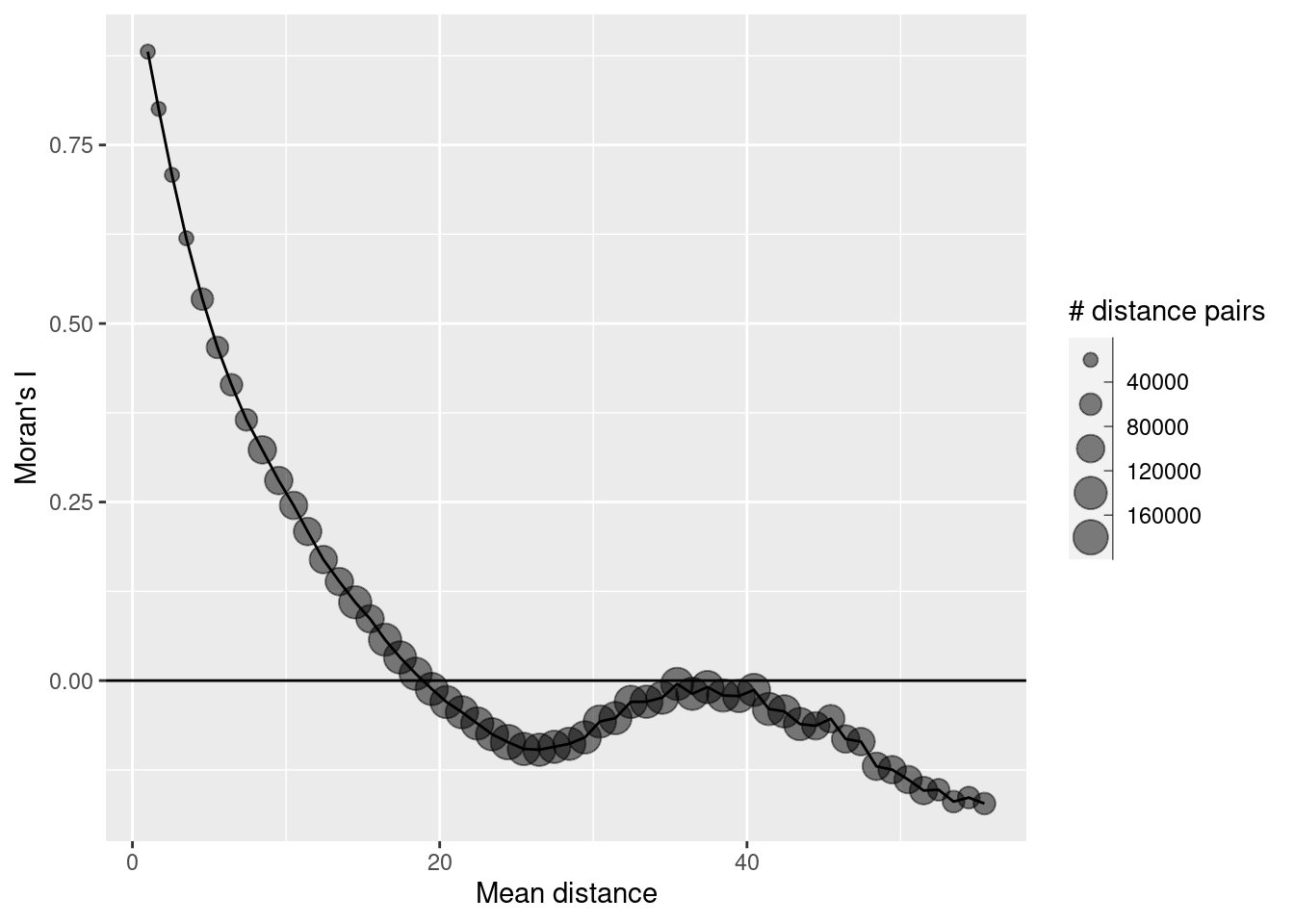
We can also use Geary’s C:
##
##  Geary C test under randomisation
##
## data:  sim1Sf$sim1
## weights: sim1_polynb_lw
##
## Geary C statistic standard deviate = 101.77, p-value < 2.2e-16
## alternative hypothesis: Expectation greater than statistic
## sample estimates:
## Geary C statistic       Expectation          Variance
##      1.329930e-01      1.000000e+00      7.257236e-05
A value close to 0 indicates strong positive autocorrelation again.
If we look at the sum of Geary’s C and Moran’s I here we see that it is close to 1. According to (Griffith and Chun, 2022) an indication of symmetricly distributed values and a not too unbalanced number of neighbors.
## Geary C statistic
## 0.132993## Moran I statistic
## 0.8668684There is no correlogram for distance classes implemented for Geary’s C but we can plot Geary’s C for different orders of neighbors.
theCorlog <- spdep::sp.correlogram(neighbours = sim1_polynb, var= sim1Sf$sim1, order = 8,
                        method = "C", style = "W")
plot(theCorlog, las=1, main= "Geary's C")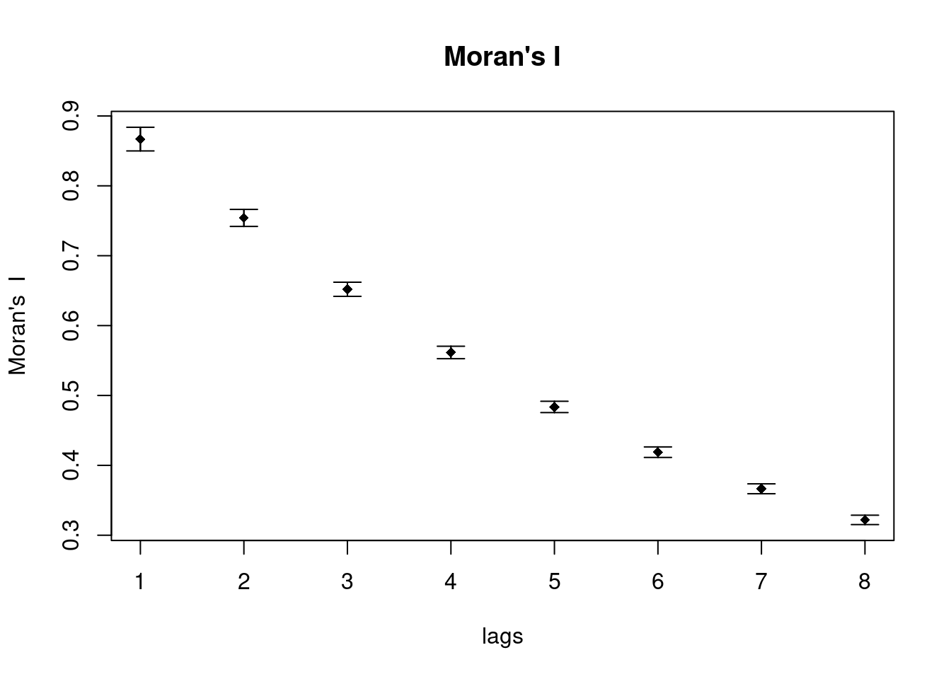
theCorlog <- spdep::sp.correlogram(neighbours = sim1_polynb, var= sim1Sf$sim1, order = 8,
                        method = "I", style = "W")
plot(theCorlog, las=1, main= "Moran's I")
As we see the plot against lags are somewhat mirrored for Geary’s C and Moran’s I.
The global Getis-Ord’s G is 83 standard deviations higher than the expected value. This clearly indicates that high values (relative to the global mean) cluster together - i.e. hotspots are present in the observed values.
## Warning in globalG.test(x = sim1Sf$sim1, listw = sim1_polynb_lw): Binary
## weights recommended (especially for distance bands)
##
## Getis-Ord global G statistic
##
## data: sim1Sf$sim1
## weights: sim1_polynb_lw
##
## standard deviate = 81.206, p-value < 2.2e-16
## alternative hypothesis: greater
## sample estimates:
## Global G statistic Expectation Variance
## 2.887191e-04 2.778550e-04 1.789823e-147.7.2 Positive autocorrelation with shorter correlation range
Let’s try autocorrelated data with a shorter correlation range:
## [using unconditional Gaussian simulation]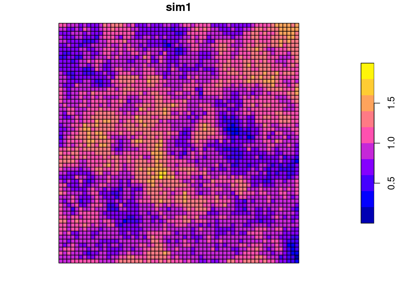
As the geometries did not change we can use the weighted list derived for the previous simulation.
##
##  Moran I test under randomisation
##
## data:  sim2Sf$sim1
## weights: sim1_polynb_lw
##
## Moran I statistic standard deviate = 91.908, p-value < 2.2e-16
## alternative hypothesis: greater
## sample estimates:
## Moran I statistic       Expectation          Variance
##      7.784168e-01     -2.778550e-04      7.178349e-05
Autocorrelation a bit weaker but still strong and clearly significant.
sim2Corlog <- correlog(theCoords$X, theCoords$Y, sim2Sf$sim1, increment = 1, resamp=1)

sim2CorlogDf <- data.frame(n = sim2Corlog$n,
           mean.of.class = sim2Corlog$mean.of.class,
           correlation = sim2Corlog$correlation)

sim2CorlogDf$psil = 5
sim1CorlogDf$psil = 10

simCorlogDf <- rbind(sim1CorlogDf, sim2CorlogDf)

ggplot(data = simCorlogDf %>% filter(mean.of.class < 2/3 * max(mean.of.class)), mapping = aes(x=mean.of.class, y= correlation, group = psil, colour= factor(psil))) +
  geom_line() +
  geom_point(alpha=.5, mapping= aes(size = n)) +
  scale_size_binned_area(name="# distance pairs", max_size = 3) +
  scale_color_discrete(name="Partial sill") +
  geom_hline(yintercept = 0) +
  xlab("Mean distance") +
  ylab("Moran's I") +
  labs(title= "Correlogram for data simulated with different partial sill")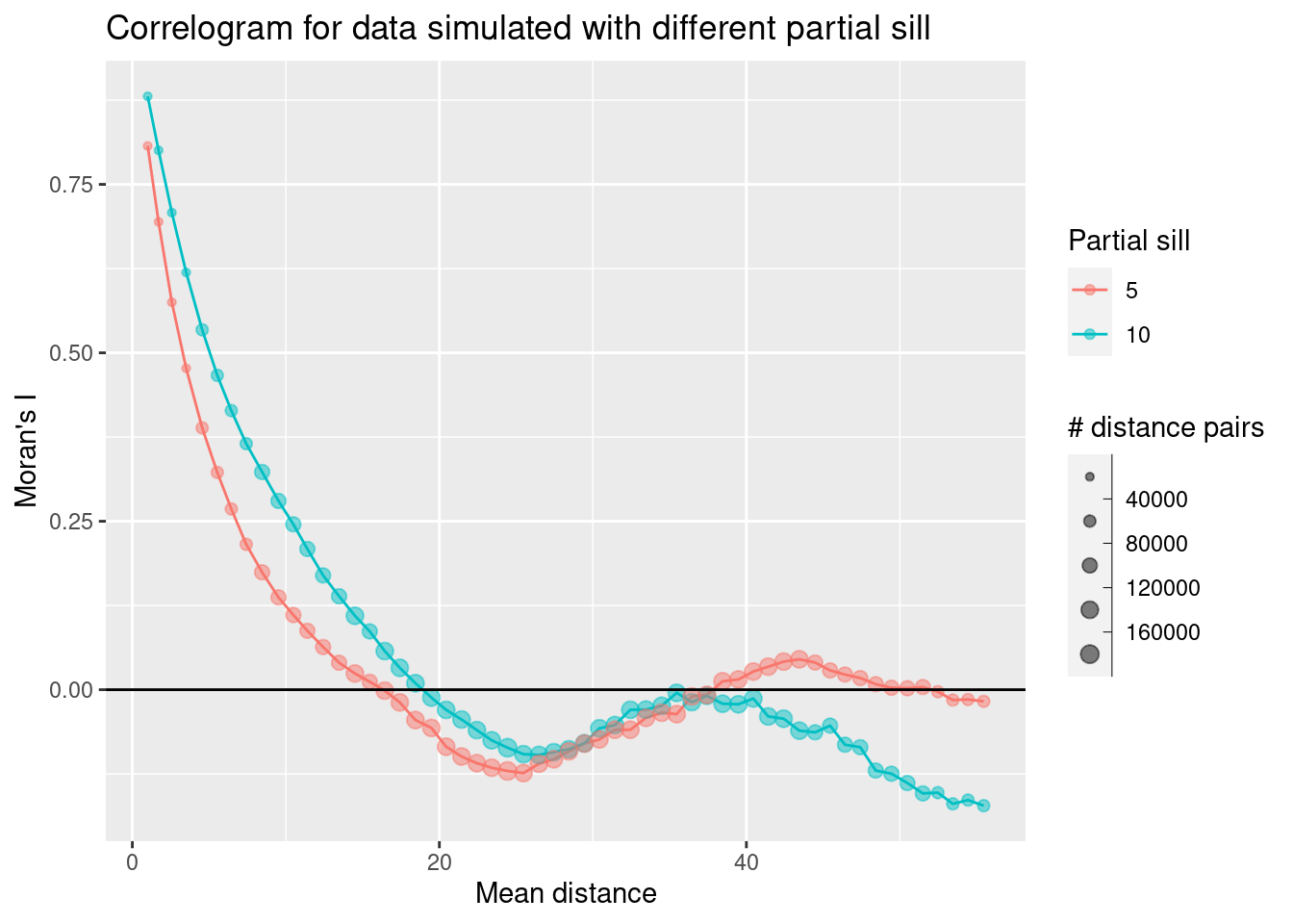
We see that the autocorrelation function starts at a slightly lower value for the second simulated data set but otherwise shows a similar behavior as for the first simulated data set. The correlation function with the shorter partial sill (which corresponds to correlation length) drops faster than the one with the higher partial sill.
moran.plot(sim2Sf$sim1, listw =  sim1_polynb_lw, las=1,
           main="Moran's scatterplot, partial sill = 10", xlab="Values", ylab="Spatially lagged values")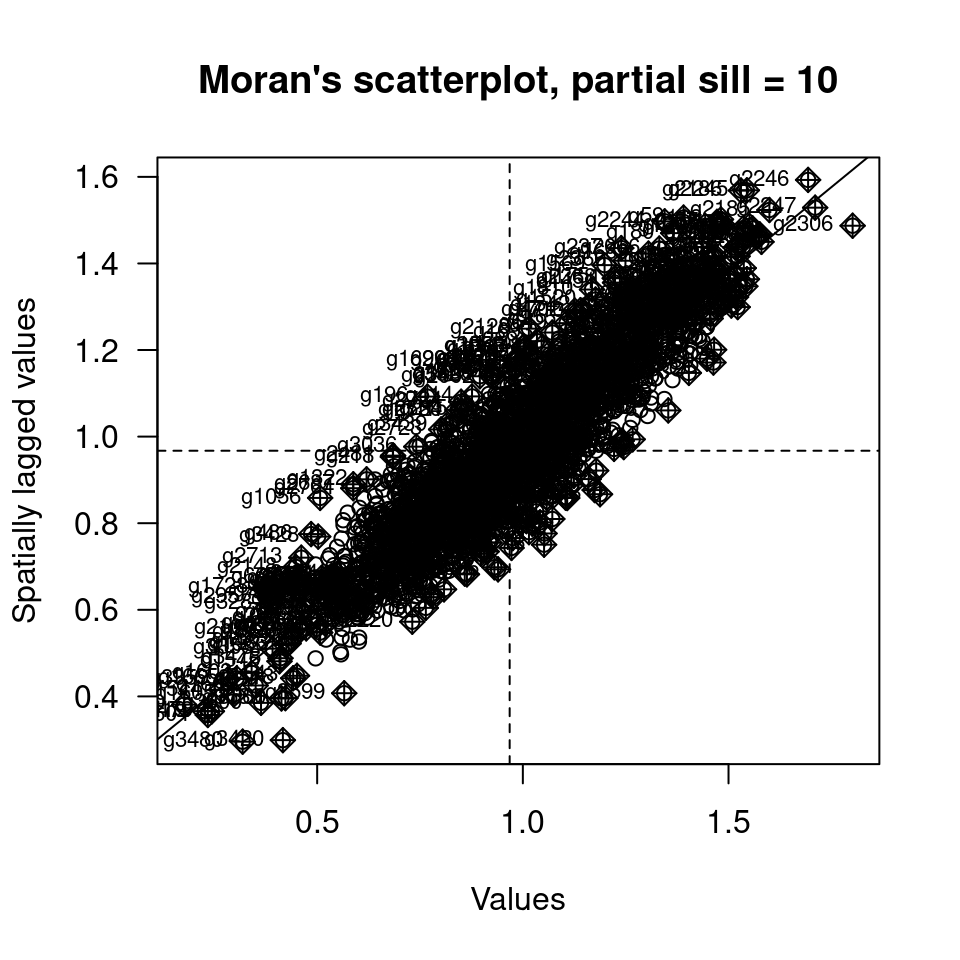
We see that nearly all data are in the upper right and lower left quadrant of the plot. This indicates (not unexpectedly) strong positive autocorrelation.
7.7.3 Induced autocorrelation
Autocorrelation can also be induced e.g. by a spatial trend. We look at this based on data we simulated by a structural component that depends on the x and y coordinates and a white noise component. We take the first simulated data set as a starting point.
## Warning: st_centroid assumes attributes are constant over geometriessim1Sf$x <- theCoords[,1]
sim1Sf$y <- theCoords[,2]
sim1Sf$sim3 <- with(sim1Sf, 2.2*x -0.7*y + rnorm(n=nrow(sim1Sf)))
tm_shape(sim1Sf) + tm_polygons(fill="sim3",
fill.scale = tm_scale_intervals(midpoint=0),
fill.legend= tm_legend(reverse=TRUE)) +
tm_layout(legend.outside = TRUE)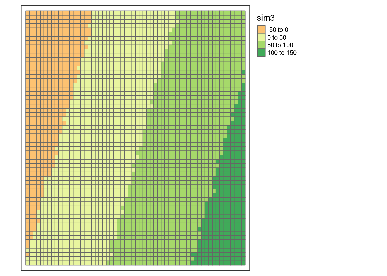
##
##  Moran I test under randomisation
##
## data:  sim1Sf$sim3
## weights: sim1_polynb_lw
##
## Moran I statistic standard deviate = 117.74, p-value < 2.2e-16
## alternative hypothesis: greater
## sample estimates:
## Moran I statistic       Expectation          Variance
##      9.973704e-01     -2.778550e-04      7.180026e-05
Strong positive autocorrelation.
# this time we can use the x and y coordinates we just attached to the sf object
sim3Corlog <- correlog(sim1Sf$y, sim1Sf$y, sim1Sf$sim3, increment = 1, resamp=1)

sim3CorlogDf <- data.frame(n = sim3Corlog$n,
           mean.of.class = sim3Corlog$mean.of.class,
           correlation = sim3Corlog$correlation)

ggplot(data = sim3CorlogDf, mapping = aes(x=mean.of.class, y= correlation, size = n)) +
  geom_point(alpha=.5) +
  geom_line(mapping = aes(x=mean.of.class, y= correlation), inherit.aes =FALSE) +
  scale_size_binned_area(name="# distance pairs") +
  geom_hline(yintercept = 0) +
  xlab("Mean distance") +
ylab("Moran's I") 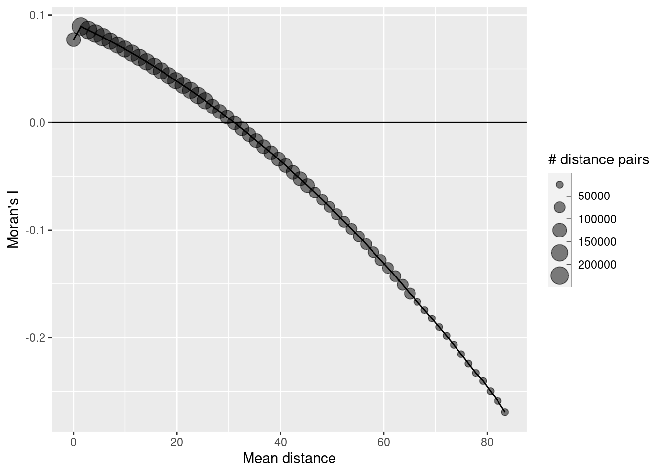
But what happens, if we remove the trend by means of a linear regression model?
##
## Call:
## lm(formula = sim3 ~ x + y, data = sim1Sf)
##
## Residuals:
##     Min      1Q  Median      3Q     Max
## -3.6089 -0.6401 -0.0260  0.6556  3.5255
##
## Coefficients:
##               Estimate Std. Error  t value Pr(>|t|)
## (Intercept)  0.0982952  0.0449184    2.188   0.0287 *
## x            2.1998154  0.0009664 2276.307   <2e-16 ***
## y           -0.7028558  0.0009664 -727.295   <2e-16 ***
## ---
## Signif. codes:  0 '***' 0.001 '**' 0.01 '*' 0.05 '.' 0.1 ' ' 1
##
## Residual standard error: 1.004 on 3597 degrees of freedom
## Multiple R-squared:  0.9994, Adjusted R-squared:  0.9994
## F-statistic: 2.855e+06 on 2 and 3597 DF,  p-value: < 2.2e-16
We attach the residuals and plot them.
sim1Sf$sim3Resid <- residuals(g)

tm_shape(sim1Sf) + tm_polygons(fill="sim3Resid",
                               fill.scale = tm_scale_intervals(midpoint=0),
                               fill.legend= tm_legend(reverse=TRUE)) +
  tm_layout(legend.outside = TRUE)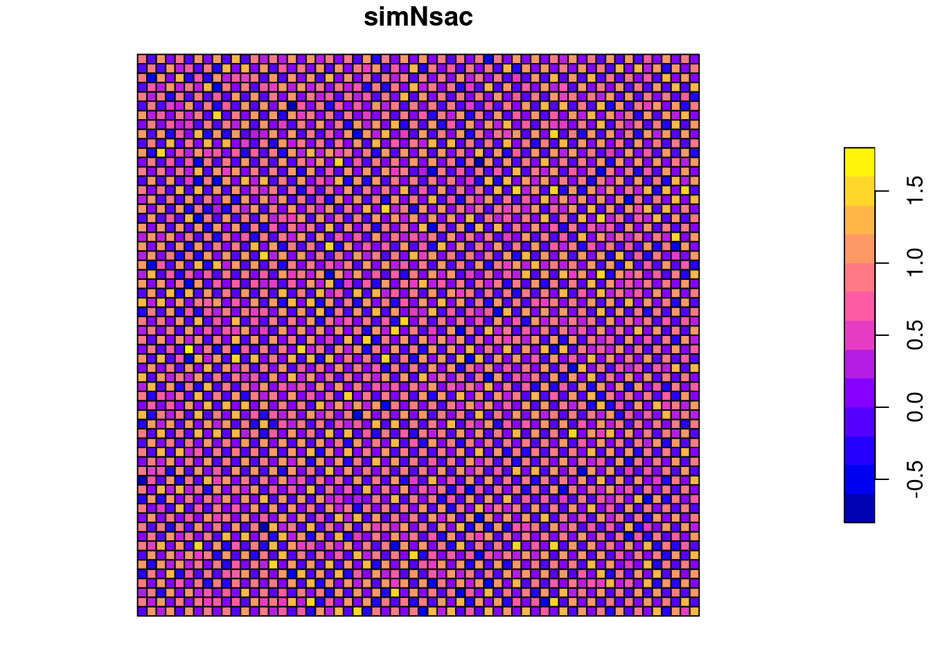
Looks like white noise. If we want to test it we need to use a different function than before. The reason is that residuals have specific properties that we need to take into account: they are centered around zero (at least this is what we assume) and therefore they are not completely independent of each other (the nth residual is determined by the n-1 residuals). lm.morantest takes the regression object and an weighted list object that specifies the neighborhood definition.
##
##  Global Moran I for regression residuals
##
## data:
## model: lm(formula = sim3 ~ x + y, data = sim1Sf)
## weights: sim1_polynb_lw
##
## Moran I statistic standard deviate = 0.20631, p-value = 0.4183
## alternative hypothesis: greater
## sample estimates:
## Observed Moran I      Expectation         Variance
##     9.122083e-04    -8.329305e-04     7.154977e-05
As suspected, the residuals are not autocorrelated.
This is an important take home message: if we have spatially structured predictors these can led to autocorrelation, even if the response variable itself is not autocorrelated. By removing the structural component we can therefore get spatially unstructured residuals. However, only if we are able to correctly specify the structural component.
7.7.4 Negative SAC
We create a regular chessboard pattern and add some mild random noise on top of it
## Warning: st_centroid assumes attributes are constant over geometriessim1Sf$x <- simCoords[,1]
sim1Sf$y <- simCoords[,2]
sim1Sf$simNsac <- (sim1Sf$x + sim1Sf$y) %%2 + rnorm(nrow(sim1Sf), mean=0, sd=0.2)
plot(sim1Sf["simNsac"])
This results in a mildly negative Moran’s I value for the queen neighborhood
##
##  Moran I test under randomisation
##
## data:  sim1Sf$simNsac
## weights: sim1_polynb_lw
##
## Moran I statistic standard deviate = -1.4239, p-value = 0.07723
## alternative hypothesis: less
## sample estimates:
## Moran I statistic       Expectation          Variance
##     -1.234453e-02     -2.778550e-04      7.181035e-05
And a strong negative autocorrelation for the rook neighborhood.
sim1_polynbRook <- poly2nb(sim1Sf, queen = FALSE)
sim1_polynbRook_lw <- nb2listw(sim1_polynbRook, style = "W")
moran.test(x = sim1Sf$simNsac, listw = sim1_polynbRook_lw, alternative="less")
##
## Moran I test under randomisation
##
## data: sim1Sf$simNsac
## weights: sim1_polynbRook_lw
##
## Moran I statistic standard deviate = -72.759, p-value < 2.2e-16
## alternative hypothesis: less
## sample estimates:
## Moran I statistic Expectation Variance
## -0.8666564532 -0.0002778550 0.0001417901If we used inverse distance weighting we get a slightly larger negative Moran’s I as the diagonal neighbors lose weight due to their longer distance.
## Warning: st_centroid assumes attributes are constant over geometriessim1Dlist <- lapply(sim1Dlist, function(x) 1/x^2)
sim1_polynb_lw_d <- nb2listw(sim1_polynb, glist=sim1Dlist, style = "W")
moran.test(x = sim1Sf$simNsac, listw = sim1_polynb_lw_d, alternative="less")##
## Moran I test under randomisation
##
## data: sim1Sf$simNsac
## weights: sim1_polynb_lw_d
##
## Moran I statistic standard deviate = -33.441, p-value < 2.2e-16
## alternative hypothesis: less
## sample estimates:
## Moran I statistic Expectation Variance
## -2.990697e-01 -2.778550e-04 7.983141e-05Again, the sum of Moran’s I and Geary’s C is close to 1 for all 3 variants of W.
## Geary C statistic
## 1.011965## Moran I statistic
## -0.01234453## Geary C statistic
## 1.866071## Moran I statistic
## -0.8666565## Geary C statistic
## 1.298623## Moran I statistic
## -0.29906977.7.5 Crude rate vs. the empirical Bayes modification
Next we are going to explore effects of an uneven population distribution across the spatial units if we are dealing with count data. If we assume that the events are Poisson distributed then the variance equals the mean, i.e. for smaller population size in a spatial unit we have less variability compared to a spatial unit with a high population size. On the other hand, for areas with a small population it is easy to get a extreme rate just by chance. For example for small villages with 100 inhabitants a single homicide will results in a homicide rate of 1%. This might happen in one year just by chance if we have a large enough number of villages. For a big city with one million inhabitants it is unlikely that we will observe a homicide rate of 1% (10,000 homicides per year).
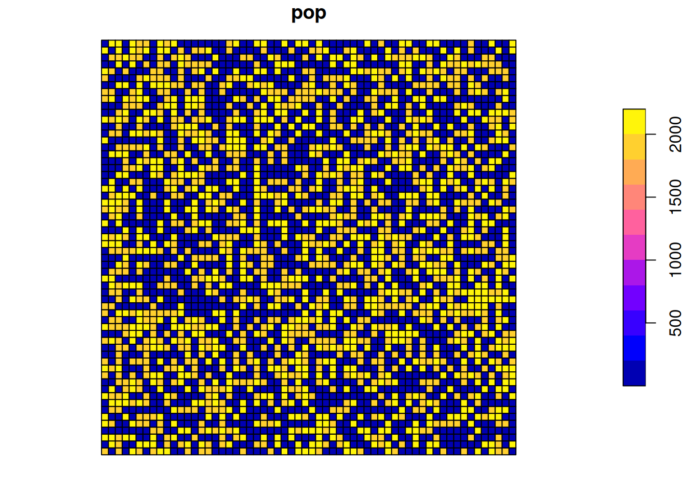
We investigate that by first simulating a strongly skewed population per grid cell (we use the same 60x60 grid topology as before, therefore we can reuse the neighborhood definition and spatial weight matrix from above). Population is set to either 10 or 1000 plus some Poisson distributed random term that takes the initial assignment (10 or 1000) as the mean ) leading to higher variability for units with a population size of 1000. Those are randomly assigned to the grid cells. For the grid cells we simulate an event by a fixed rate.
gridDim <- 60
xy <- expand.grid(x=1:gridDim, y=1:gridDim)
# create a vector of very diverse counts
thePop <- rep(c(10, 1000), gridDim * gridDim)
# add some poisson distributed noise
thePop <- thePop + rpois(n=  gridDim * gridDim, lambda=thePop)
# assign values randomly to the grid
xy$pop <- sample(thePop, size =  gridDim * gridDim, replace = FALSE)
# add event using a low rate (rare event)
# variance equals the mean
theRate <- 0.1
# we need to round as we want integer values (count data)
xy$event <- round(rpois(n=  gridDim * gridDim, lambda=xy$pop) * theRate)
# convert those into an sf polygon data set
spGridded <- xy
gridded(spGridded) = ~x+y

countSimSf <- as(spGridded, "SpatialPolygonsDataFrame") %>% st_as_sf()

plot(countSimSf["event"])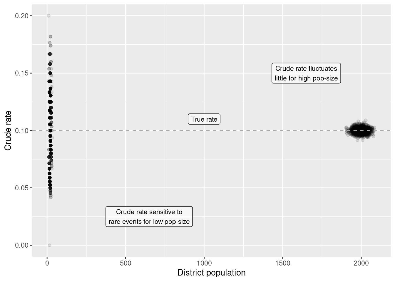
The distribtion of the population size in space:
Calculate the crude rate:
Calculate the empirical Bayes modification:
countSimEbi <- EBImoran.mc(n= st_drop_geometry(countSimSf)%>% pull("event"),
              x= countSimSf$pop, listw = sim1_polynb_lw, nsim =999)
## The default for subtract_mean_in_numerator set TRUE from February 2016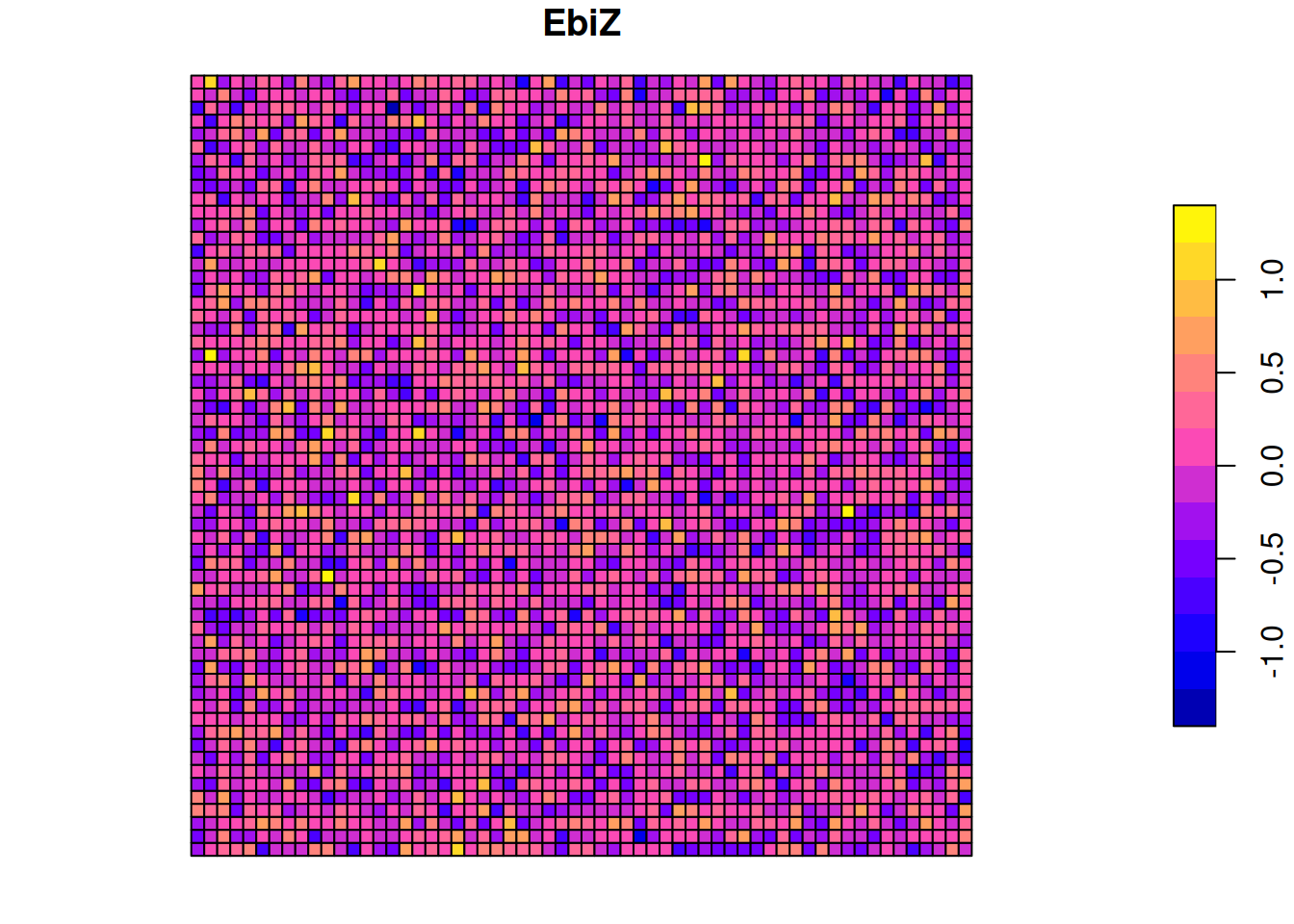
Plot crude rate against the empirical Bayes index:
ggplot(countSimSf, aes(x= crudeRate, y = EbiZ)) +
         geom_point(alpha=.2) +
  xlab("Crude rate") +
  ylab("Empirical Bayes z-score")
As we see, the crude rate does not well align with the, theoretically more precise, z-score from the empirical Bayes index. Why that? It is due to the property of the poisson distribution that the variance equals the mean. For a small population size (mean) the variance is lower, that means it is much more likely to get a more extreme rate. This shows up nicely, when we plot the crude rate against the population of each cell.
ggplot(countSimSf, aes(y= crudeRate, x = pop)) +
        geom_point(alpha=.1) +
  ylab("Crude rate") + xlab("District population") +
  annotate(geom="label", label="Crude rate sensitive to\nrare events for low pop-size",
           x=650, y= 0.025,
           alpha = .6, size=3) +
  annotate(geom="label", label="Crude rate fluctuates\nlittle for high pop-size",
           x=1650, y= 0.15,
           alpha = .6, size=3) +
  geom_hline(yintercept = 0.1, lty=2, colour = "darkgrey") +
  annotate(geom="label", label="True rate",
           x=1000, y= 0.11,
           alpha = .6, size=3)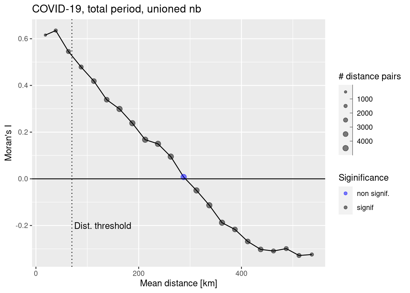
This effects all types of statistical analysis, including but not limited to correlation, regression, classification, testing for spatial autocorrelation. If the population size varies less extreme, the effect is much smaller and might even be ignored, especially if the rate is relatively high, such that rare events don’t effect the outcome so much.
7.8 The COVID-19 data case study - global spatial autocorrelation
We will use the covid-19 incidence data for Germany that have been introduced previously.
## Reading layer `kreiseWithCovidMeldeWeeklyCleaned' from data source
##   `/home/slautenbach/Documents/lehre/HD/git_areas/spatial_data_science/spatial-data-science/data/covidKreise.gpkg'
##   using driver `GPKG'
## Simple feature collection with 400 features and 145 fields
## Geometry type: MULTIPOLYGON
## Dimension:     XY
## Bounding box:  xmin: 280371.1 ymin: 5235856 xmax: 921292.4 ymax: 6101444
## Projected CRS: ETRS89 / UTM zone 32N## Warning: st_point_on_surface assumes attributes are constant over geometriesdistnb <- dnearneigh(poSurfKreise, d1=1, d2= 70*10^3)
unionedNb <- union.nb(distnb, polynb)
dlist <- nbdists(unionedNb, st_coordinates(poSurfKreise))
dlist <- lapply(dlist, function(x) 1/x)
unionedListw_d <- nb2listw(unionedNb, glist=dlist, style = "W")We calculate the empirical Bayes modification of Moran’s I (that considers the uneven distribution of the population at risk) for the COVID-19 cases for the total period at the level of the German districts:
ebiMc <- EBImoran.mc(
  n= covidKreise$sumCasesTotal,
  x= covidKreise$EWZ,
  listw = unionedListw_d,
  nsim =999)
## The default for subtract_mean_in_numerator set TRUE from February 2016##
## Monte-Carlo simulation of Empirical Bayes Index (mean subtracted)
##
## data: cases: covidKreise$sumCasesTotal, risk population: covidKreise$EWZ
## weights: unionedListw_d
## number of simulations + 1: 1000
##
## statistic = 0.6948, observed rank = 1000, p-value = 0.001
## alternative hypothesis: greaterIn the past it was necessary to drop the sticky geometry column in sfobjects before using EBImoran.mc, using st_drop_geometry. For newer versions of spdep this seems no longer necessary.
So clearly the covid-19 incidence rate for the whole period is clustered (positive spatial autocorrelation). This is in line with our first impression when we looked at the map.
We can also plot the distribution of EBI values that we have got for the permutation.
n <- length(ebiMc$res)
simValues <- data.frame(ebiMc$res[1:(n-1)] )
names(simValues) <- "simulated"
obsValue <- ebiMc$res[n]

ggplot(simValues, aes(x=simulated)) + geom_histogram(binwidth = 0.005) +
  geom_vline(xintercept = obsValue, col="red") +
  geom_text(aes(0.1, 60, label='permuation')) +
  xlab("Moran's I") +
  geom_text(aes(0.6, 60, label='observed', colour = "red"), show.legend = FALSE) +
  ylab("Count") + labs(title = "Observed versus permutation test for EBI", subtitle = "COVID-19 cases for whole period")
## Warning in geom_text(aes(0.1, 60, label = "permuation")): All aesthetics have length 1, but the data has 999 rows.
## ℹ Please consider using `annotate()` or provide this layer with data containing
## a single row.## Warning in geom_text(aes(0.6, 60, label = "observed", colour = "red"), show.legend = FALSE): All aesthetics have length 1, but the data has 999 rows.
## ℹ Please consider using `annotate()` or provide this layer with data containing
## a single row.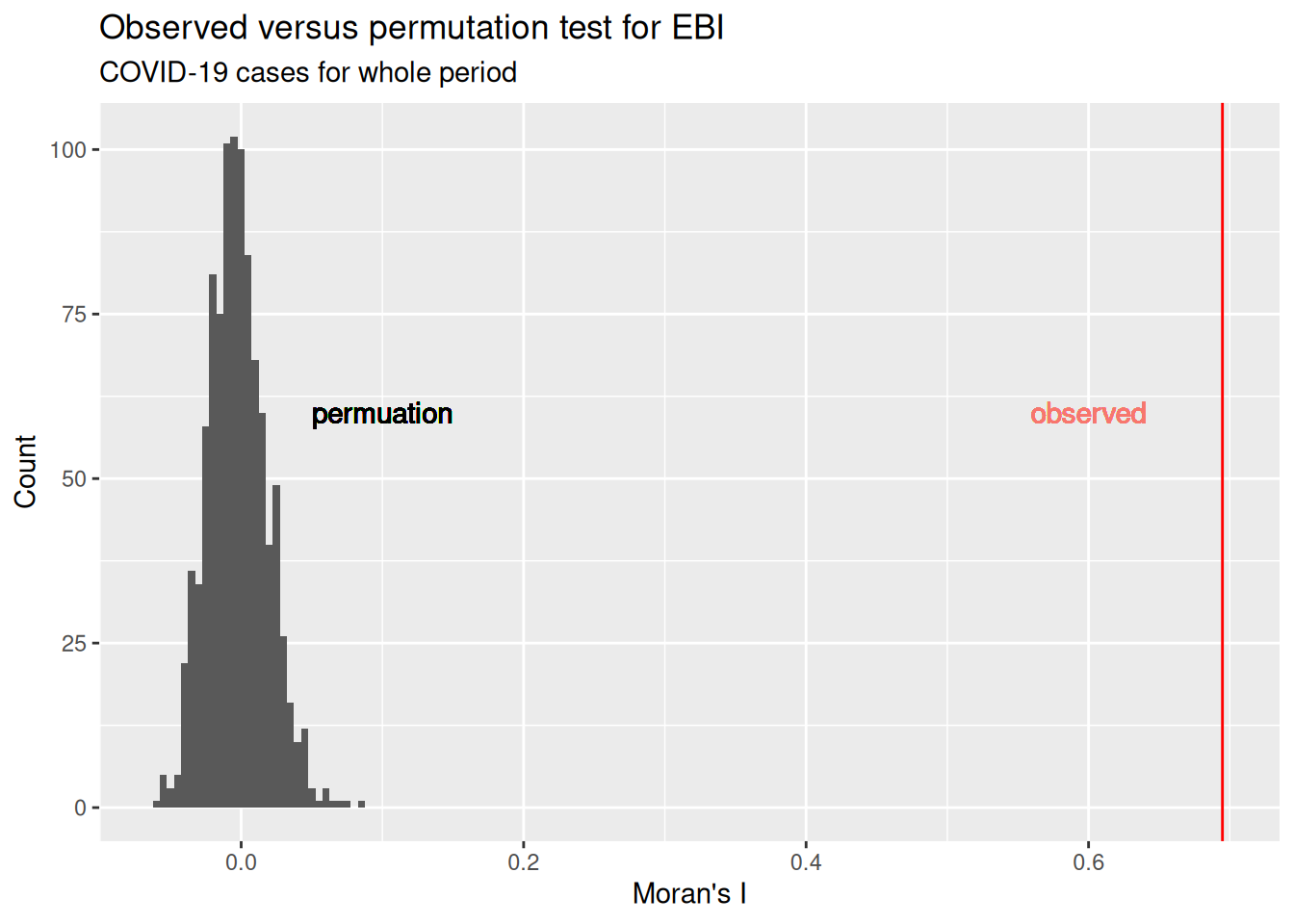
EBImoran.mc returns also the results of the empirical bayes modification which we can use for the correlogram.
theCoordsKreise <- st_centroid(poSurfKreise) %>%
  st_coordinates() %>%
  as.data.frame()

# resampling on
covidCorlog <- correlog(theCoordsKreise$X, theCoordsKreise$Y, ebiMc$z, increment = 25000, resamp=100, quiet = TRUE)

covidCorlogDf <- data.frame(n = covidCorlog$n,
           mean.of.class = covidCorlog$mean.of.class,
           correlation = covidCorlog$correlation,
           signif = ifelse(covidCorlog$p > 0.05, 0,1))

covidCorlogDf$signif <- factor(covidCorlogDf$signif, levels = c(0,1), labels= c("non signif.", "signif"))

ggplot(data = covidCorlogDf %>% filter(mean.of.class < 2/3 * max(mean.of.class)), mapping = aes(x=mean.of.class /1000, y= correlation)) +
  geom_line() +
  geom_point(alpha=.5, mapping= aes(size = n, color=signif)) +
  scale_size_binned_area(name="# distance pairs", max_size = 3) +
  scale_color_discrete(name="Siginificance", type = c("blue", "black")) +
  geom_hline(yintercept = 0) +
  xlab("Mean distance [km]") +
  ylab("Moran's I") +
  labs(title= "COVID-19, total period, unioned nb") +
  geom_vline(xintercept = 70, lty=3) +
  annotate("text", x=130, y=-0.2, label= "Dist. threshold")
We see that Moran’s I is more or less linearly decreasing with distance. Based on this plot we could select even a higher distance threshold.
Alternatively, we could plot Moran’s I for all neighbors of different order (neighbors, neighbors of neighbors,…)
theCorlog <- spdep::sp.correlogram(neighbours = unionedNb, var=  ebiMc$z, order = 8,
                        method = "I", style = "W")
plot(theCorlog, las=1, main= "COVID-19, total period, unioned nb")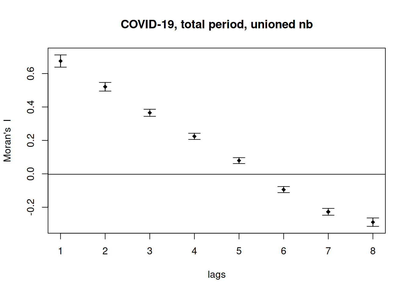
moran.plot(ebiMc$z, listw =  unionedListw_d, las=1, labels = covidKreise$GEN,
           main="Moran's scatterplot\nunioned NB, distance weighted", xlab="COVID-19 EBM", ylab="Spatially lagged values")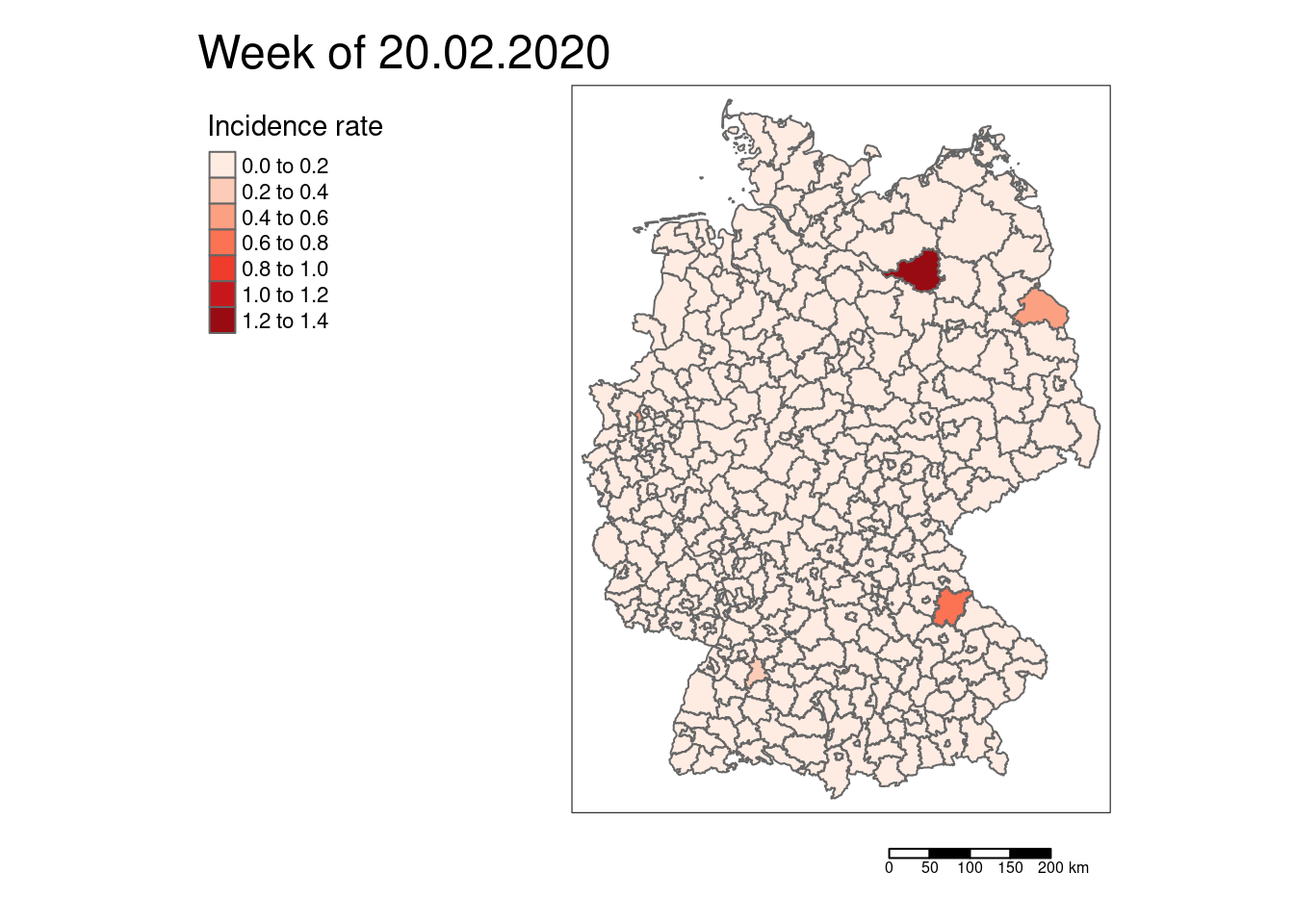
Using the label argument with the names of the districts field helps us to indicate which districts are most far away from the regression line. However, there is not much deviance from the regression line.
7.8.0.1 Why is it important to use not the crude rate?
If the count process can be described as Poisson then the variance equals the mean, i.e. for higher means we assume a larger variability. This is not considered if we simply take the crude rate. In addition, for spatial units with a small population rare events can have a much stronger effect than on spatial units with large populations. It is much more likely to find a large proportion of inhabitants infected in a district with 50.000 inhabitants than in Berlin with around 4 million inhabitants.
7.8.0.1.1 High rates: the example of the sum of COVID-19 cases for the whole period
Let’s calculate the z-Score of the empirical Bayes modification and compare it to the crude incidence rate.
covidKreise$incidenceTotalZ <- ebiMc$z
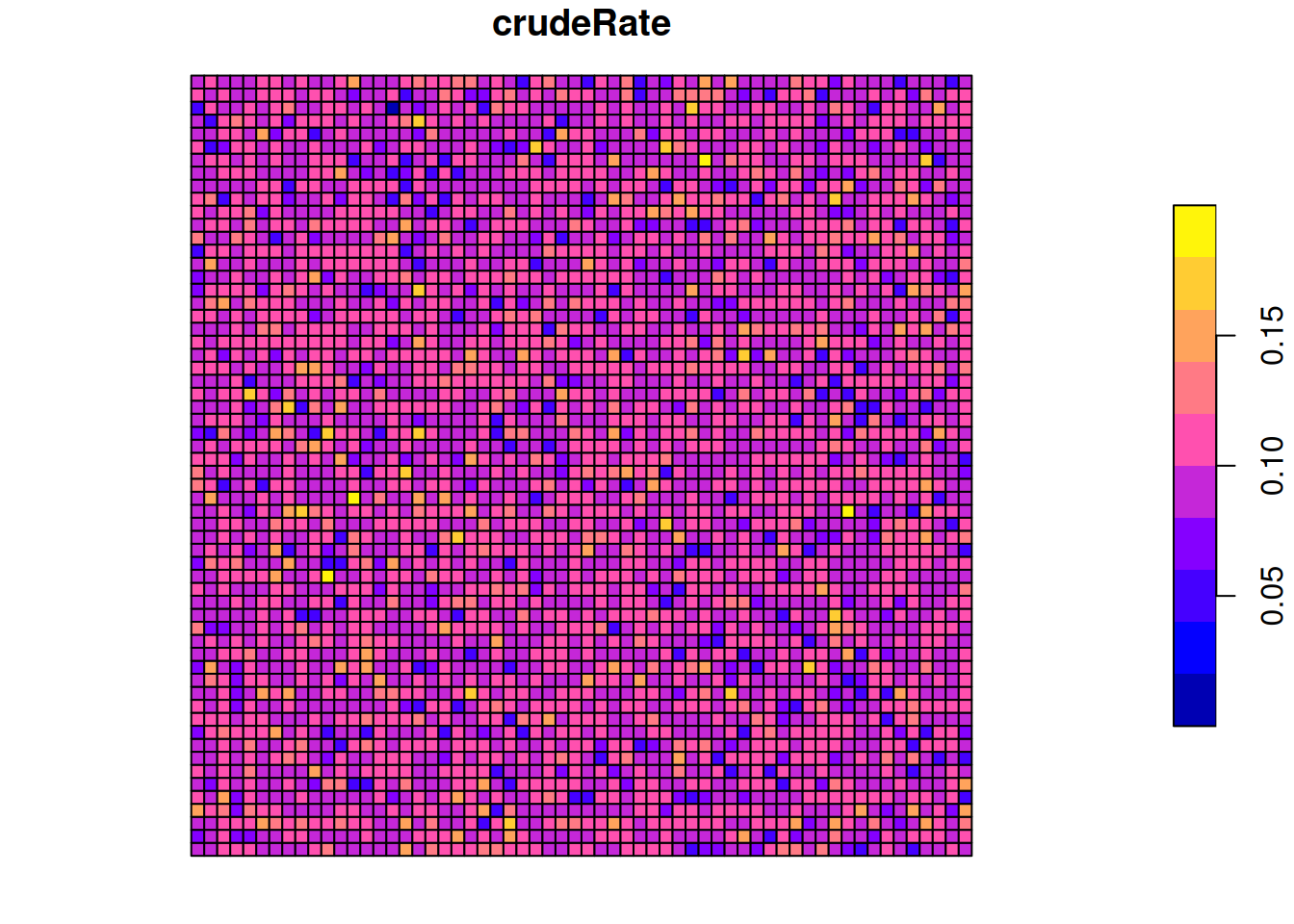
ggplot(covidKreise, aes(x=incidenceTotal, y= incidenceTotalZ)) +
geom_point() + geom_smooth(method="lm", colour = "red")## `geom_smooth()` using formula = 'y ~ x'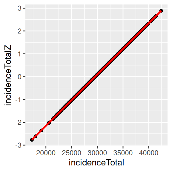
The z-score by the empirical Bayes modification represents the rates properly. In our example here, z-score, and the crude rate are nearly perfectly correlated. Therefore, it doesn’t really matter, which measure we use. This is however not always the case. The stronger the population at risk varies between the different spatial units, the less it is advisable to use the crude rate. Differences can also be expected to be more pronounced if the case numbers are lower, i.e. then looking at the incidence for a single week. As a general recommendation it is a save bet to use the empirical Bayes modification for rates in general.
##                 incidenceTotal incidenceTotalZ
## incidenceTotal       1.0000000       0.9999999
## incidenceTotalZ      0.9999999       1.0000000
We can also use the z-scores of the total incidence rate to calculate Geary’s c or Gets-Ord’s G. Or we could use the raw data as the EBI does not seem necessary here as shown above.
##
##  Monte-Carlo simulation of Geary C
##
## data:  ebiMc$z
## weights: unionedListw_d
## number of simulations + 1: 1000
##
## statistic = 0.30123, observed rank = 1, p-value = 0.001
## alternative hypothesis: greater
For Getis-Ord’s G we need to use the crude rate as we can only apply it to non-negative values.3
## Warning in globalG.test(covidKreise$incidenceTotal, listw = unionedListw_d):
## Binary weights recommended (especially for distance bands)
##
## Getis-Ord global G statistic
##
## data: covidKreise$incidenceTotal
## weights: unionedListw_d
##
## standard deviate = 10.044, p-value < 2.2e-16
## alternative hypothesis: greater
## sample estimates:
## Global G statistic Expectation Variance
## 2.545847e-03 2.506266e-03 1.552934e-11All measures indicate - as expected - positive spatial autocorrelation.
7.8.0.1.2 Low rates - COVID-19 cases for a single week: 20.02.2020
covidKreise <- covidKreise %>%
  mutate(incidenceWeek_2020_02_20 = casesWeek_2020_02_20 /EWZ * 10^5)

# tmap v4
tm_shape(covidKreise) +
  tm_polygons(fill="incidenceWeek_2020_02_20",
              fill.scale = tm_scale_intervals(values= "brewer.reds"),
              fill.legend = tm_legend( title= "Incidence rate", reverse = TRUE)) +
  tm_scalebar() +
  tm_title(text = "Week of 20.02.2020") +
  tm_layout(legend.outside = TRUE, legend.outside.position = "left", attr.outside = TRUE)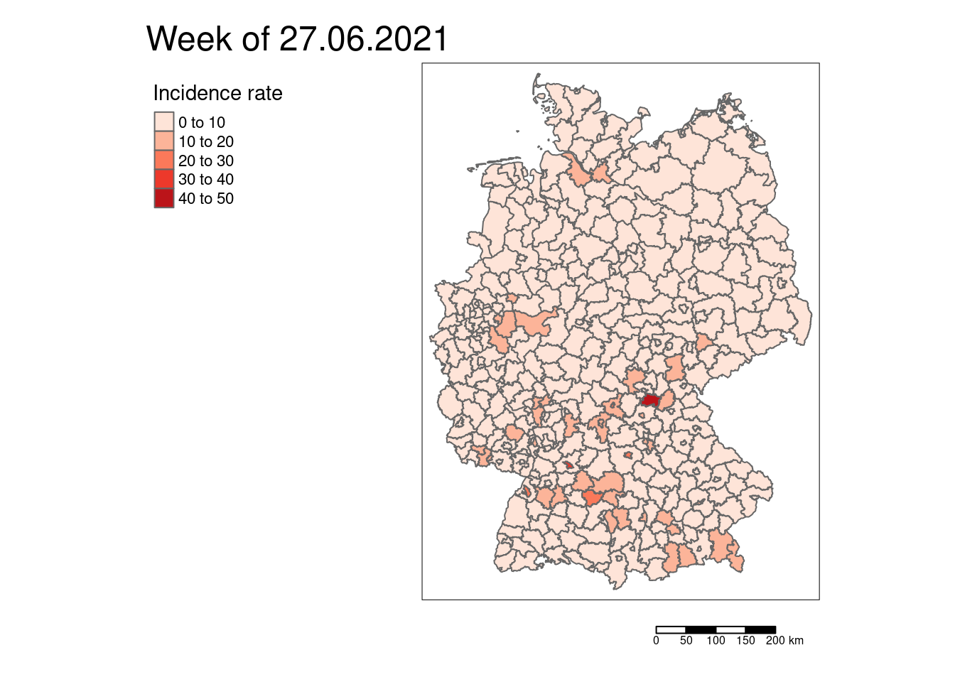
# tmap v3
#tm_shape(covidKreise) +
#  tm_polygons(col="incidenceWeek_2020_02_20", title= "Incidence rate", palette= "Reds") + tm_scale_bar() +
#  tm_layout(legend.outside = TRUE, legend.outside.position = "left", attr.outside = TRUE,
#            main.title = "Week of 20.02.2020")
At the beginning of the pandemic we had mostly no cases. Only a few districts had reported COVID-19 cases. And even there, the rates were low.
ebiMc_2020_02_20 <- EBImoran.mc(n= st_drop_geometry(covidKreise)%>% pull("casesWeek_2020_02_20"),
              x= covidKreise$EWZ, listw = unionedListw_d, nsim =999)
## The default for subtract_mean_in_numerator set TRUE from February 2016##
## Monte-Carlo simulation of Empirical Bayes Index (mean subtracted)
##
## data: cases: st_drop_geometry(covidKreise) %>% pull("casesWeek_2020_02_20"), risk population: covidKreise$EWZ
## weights: unionedListw_d
## number of simulations + 1: 1000
##
## statistic = -0.0090759, observed rank = 620, p-value = 0.38
## alternative hypothesis: greaterNo significant global spatial autocorrelation
##                          incidenceWeek_2020_02_20 z_2020_02_20
## incidenceWeek_2020_02_20                 1.000000     0.980559
## z_2020_02_20                             0.980559     1.000000
The correlation between z-score (EBI) and crude rate is still very high. However, this is mainly due to the many zeros which are not effect by the EBI. For those districts with a rate we see a clear and non-linear deviation between EBI z-score and the crude rate. The districts with COVID-19 cases had relatively low number of inhabitants. Here it would definitely be beneficial to use the EBI and not the crude rate.
ggplot(covidKreise, aes(x=incidenceWeek_2020_02_20, y= z_2020_02_20)) +
  geom_point(alpha=.25, mapping=aes(size= EWZ)) +
  geom_smooth(method="lm", colour = "red", show.legend = FALSE) +
  xlab("Incidence") + ylab("EBI of incidence") +
  labs(title="COVID-19, german districts", subtitle = "Week of 20.02.2020")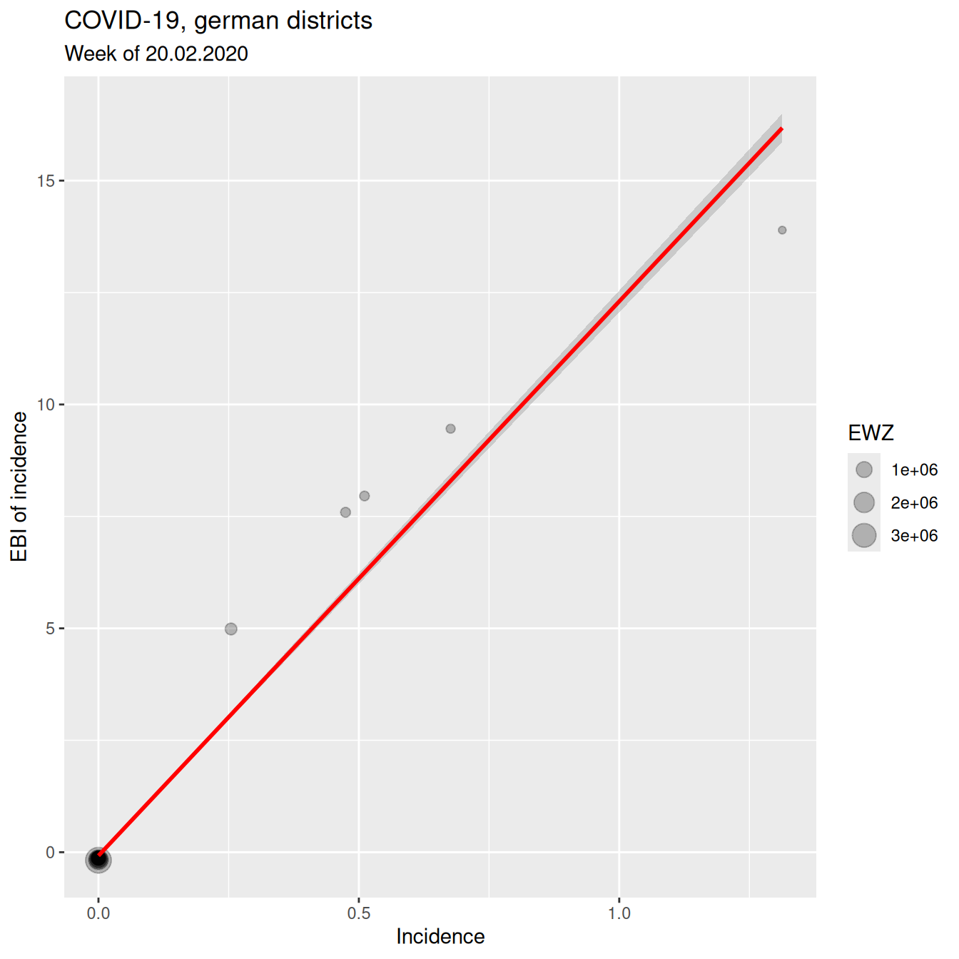
7.8.0.1.3 Low rates - COVID-19 cases for another single week
covidKreise <- covidKreise %>%
  mutate(incidenceWeek_2021_06_27 = casesWeek_2021_06_27 /EWZ * 10^5)

tm_shape(covidKreise) +
  tm_polygons(fill="incidenceWeek_2021_06_27",
              fill.scale = tm_scale_intervals(values= "brewer.reds", style="pretty"),
              fill.legend = tm_legend(title= "Incidence rate", reverse= TRUE) ) +
  tm_scalebar() +
  tm_title(text= "Week of 27.06.2021") +
  tm_layout(legend.outside = TRUE, legend.outside.position = "left", attr.outside = TRUE )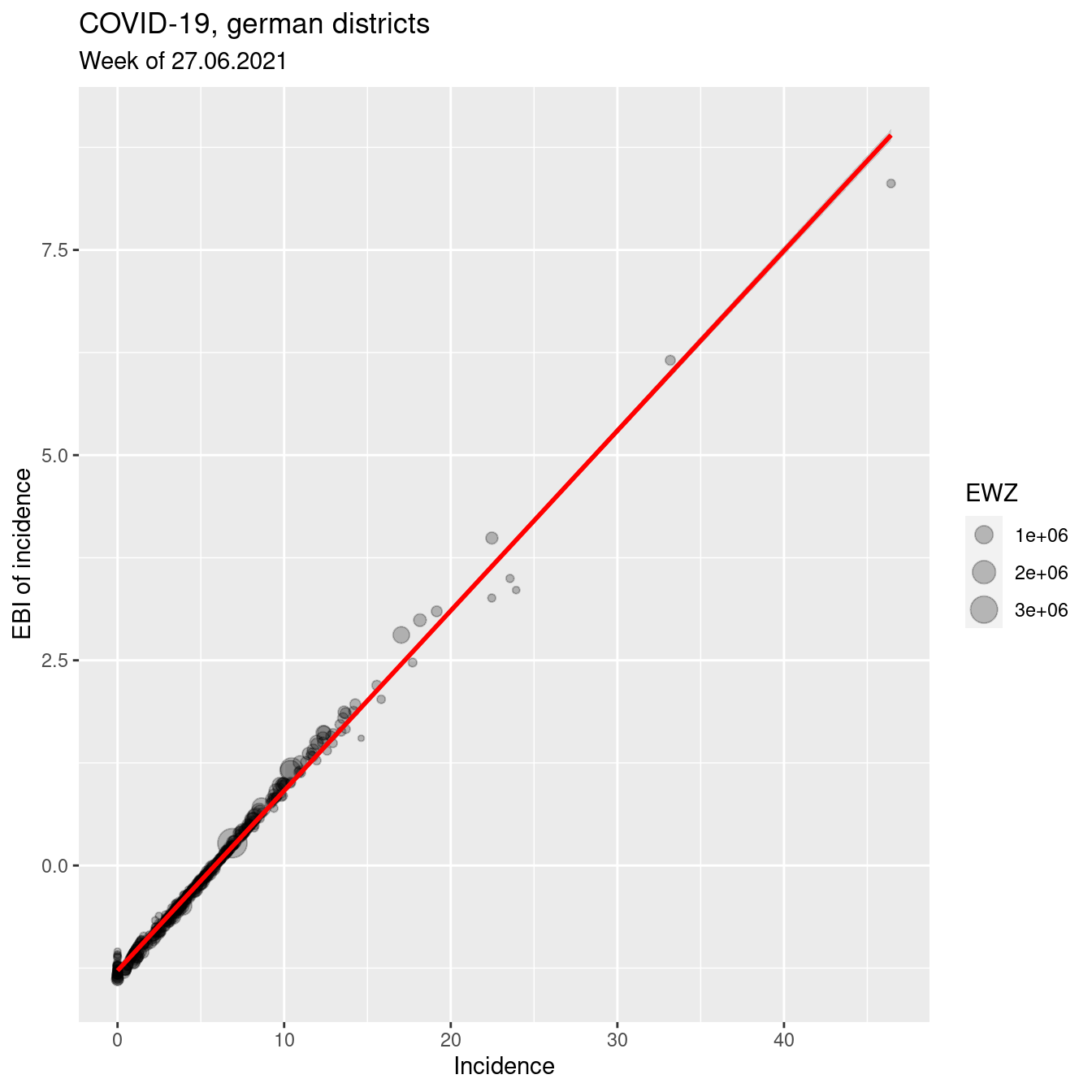
# tmap v3
# tm_shape(covidKreise) +
#   tm_polygons(col="incidenceWeek_2021_06_27", title= "Incidence rate", palette= "Reds") + tm_scale_bar() +
#   tm_layout(legend.outside = TRUE, legend.outside.position = "left", attr.outside = TRUE,
#             main.title = "Week of 27.06.2021")
ebiMc_2021_06_27 <- EBImoran.mc(n= st_drop_geometry(covidKreise)%>% pull("casesWeek_2021_06_27"),
x= covidKreise$EWZ, listw = unionedListw_d, nsim =999)## The default for subtract_mean_in_numerator set TRUE from February 2016##
## Monte-Carlo simulation of Empirical Bayes Index (mean subtracted)
##
## data: cases: st_drop_geometry(covidKreise) %>% pull("casesWeek_2021_06_27"), risk population: covidKreise$EWZ
## weights: unionedListw_d
## number of simulations + 1: 1000
##
## statistic = 0.20637, observed rank = 1000, p-value = 0.001
## alternative hypothesis: greaterSignificant spatial autocorrelation.
moran.mc(st_drop_geometry(covidKreise)%>% pull("incidenceWeek_2021_06_27"),
              listw = unionedListw_d, nsim =999)
##
## Monte-Carlo simulation of Moran I
##
## data: st_drop_geometry(covidKreise) %>% pull("incidenceWeek_2021_06_27")
## weights: unionedListw_d
## number of simulations + 1: 1000
##
## statistic = 0.1927, observed rank = 1000, p-value = 0.001
## alternative hypothesis: greaterVery similar results for the crude rate
##                          incidenceWeek_2021_06_27 z_2021_06_27
## incidenceWeek_2021_06_27                1.0000000    0.9969461
## z_2021_06_27                            0.9969461    1.0000000
The correlation between z-score (EBI) and crude rate is still very high.
ggplot(covidKreise, aes(x=incidenceWeek_2021_06_27, y= z_2021_06_27)) +
  geom_point(alpha=.25, mapping=aes(size= EWZ)) +
  geom_smooth(method="lm", colour = "red", show.legend = FALSE) +
  xlab("Incidence") + ylab("EBI of incidence") +
  labs(title="COVID-19, german districts", subtitle = "Week of 27.06.2021")
Lessons learned: as expected if the number of cases is sufficiently high, the EBI z-score and the crude rate do not differ strongly.
However, this does not imply that the EBI is not useful for all kind of data. If our data is charaterized by low count data and a varying population the EBI needs to be applied. Examples that require the EBI application ae the number of Tweets for 2-week periods at census track level for NYC or the number of kidney cancer cases per county in the US (a rare cancer type).
References
The data were simulated using the queen contiguity neighborhood definition of the
bhicvdataset from thespdeppackage with row standardization. A simultaneous autoregressive (SAR) process was used: \((I-\rho W)^{-1} \cdot \epsilon\) with $N(0,1) $↩︎The z-score contains by definition negative values.↩︎