Chapter 6 Defining neighborhood relationships and the spatial weight matrix W
6.1 Cheat sheet
The following packages are required for this chapter:
require(sf)
require(spdep)
require(sp)
require(ncf)
require(tmap)
require(ggplot2)
require(ggpubr)
require(gstat) # for simulation of autocorrelated data
require(dplyr)
require(tripack) # for triangulation, you might need to install this package
Important commands:
spdep::dnearneigh- distance based neighbor definitionspdep::knearneigh- in combination withspdep::knn2nb- k-nearest neighbors definitionspdep::poly2nb- contiguity based neighborhood definitionspdep::nbdists- create distance weights for neighborhood definitionspdep::union.nb- union two neighborhood listsspdep::nb2listw- standardization of neighborhood listspdep::lag.listw- computing a spatially lagged version of a variable vector
6.2 Theory
6.2.1 The spatial weight matrix W
Spatial pattern are based on some definition of neighborhood relationship between the spatial units. They are represented by a spatial weight Matrix \(W\) that describes which spatial units are considered neighbors or not as well as the strength of that neighborhood relationship. Usually \(W\) is standardized and then sometimes named \(W*\). Here we will be a bit casual with respect to the use of the terminology and frequently use \(W\) also for the standardized form.
I \(R\) the weight matrix is represented in form of a weighted list but it is easy to convert to the matrix form and back so this should not bother you.
\(W\) captures the spatial relationships and is therefore an essential part of many spatial analysis tool, including measures of global and spatial autocorrelation, spatial eigenvector mapping, the spatial error and lag model and many more. Using a different weight matrix will lead to different results in many situation. Therefore, it is of importance to define neighborhood relationships in a way that is suitable for the data. As usual there is no best way of defining \(W\) as it depends on the problem at hands. \(W\) is a model of spatial relationships and as for all models it is true that all models are wrong but some are useful. So we need to think and do our best to come up with a suitable neighborhood relationship. It might also be a good idea to test different reasonable ways of defining \(W\) and to compare results.
In the following we will explore a few basic concepts to define neighborhoods. Additionally, a few hints are given which aspects of \(W\) should be checked. These provide a basis for modelling \(W\) - however, for real world applications you might consider additional ways for defining \(W\).
6.2.2 Different ways to define neighborhoods
Investigating spatial relationships depends on a definition of a neighborhood. The question is not as obvious as it sounds especially for unevenly sized and shaped objects such as districts. We could define neighbors based on e.g.:
- a distance threshold for the centroids of the objects,
- if two polygons share an edge
- select the closest k neighbors for each object
- use a topological definition such as a Delauny triangulation
- a combination of those
If we would have other data we could also base the neighborhood definition e.g. on:
- the number of inhabitants of one district visiting the other district
- the average travel time (by car or public transport) between 2 districts, weighted by the population that is unevenly distributed in space
- …
In other contexts, researchers have specified neighborhood relationships based on the interaction between locations. In economic geography for example, on might define neighborhoods (and strength of interaction (weights)) based on import and export relationships. Such weights will usually not be symmetric. Other studies have based the weight matrix on hierarchical relationships derived from Central Place Theory. This theory assumes that smaller municipalities depend on larger cities (higher centrality) but not vice versa. A couple of studies on tax competition have constructed weights based on relative market potential.
We will stick here with the first series of options as these can be simply derived from the geometries.
The selection of a neighborhood should be done based at the problem at hands.
Neighbors are considered e.g. for the calculation of spatial autocorrelation measures such as Moran’s I or to create spatially lagged predictor variables or for all types of spatial regression modelling, such as spatial eigenvector mapping, spatial lag and spatial error models or the Besag-York-Mollié model.
To assess the usefulness of a neighborhood for the question at hand one might consider the following aspects in addition to a visual inspection:
- are there island (observations without neighbors)? Is it useful to consider these as real island or are there connections in the real world? An island might be connected by ferry, bridge or airplane to other spatial units so it might be good to incorporate that link manually. Island cause problems for the upcoming analysis steps and their interpretation so it is good to ensure that they are required.
- is the neighborhood definition symmetric? k-nearest neighborhood definitions frequently lead to asymmetric neighborhoodd definitions that are problematic for analysis and interpretation. It is possible to make asymmetric neighborhood definitions symmetric by a union of the upper and lower triangular part of the adjacency matrix.
- are the neighbors distributed relatively evenly across the different spatial units or are there strong differences and are these differences useful for the problem at hands?
For neighborhood definition that contain island one has to enforce calculation by setting the parameter zero.policy = TRUE for all following steps. This implies that you know that the calculation has to be carefully interpreted and that these consequences are well understood by you. If you are not sure if you understand the consequences avoid neighborhood definitions that contain empty neighborhoods for some spatial units. It might be an option to exclude the effected spatial units from the further analysis but this should be justified and needs to be clearly documented and reported. It is not possible to provide general advise in this respect as the validity and usefulness of such a step it depends on the data and the question at hands.
6.2.3 Are all neighbors of same importance? Weigthing of neighbors based on for example distance
It is possible to adjust the weight of neighbors based on additional information. Distance is frequently used for this purpose by defining an inversely weighted approach ( \(w_{i,j} = \frac{1}{dist_{i,j}^p}\) ) with p as a tuning parameter to specify how strongly weights drop with distance). Another way of defining distance relationships is by an exponential function with a negative coefficient: \(w_{i,j} = e^{- \lambda * dist_{i,j}}\), \(\lambda > 0\).
The following functions are frequently used:
- “idw” - inverse distance weighting: \(w_{ij}= d_{ij}^{-\alpha}\)
- “exp” - exponential distance decay: \(w_{ij}= e^{-\alpha \cdot d_{ij}}\)
- “dpd” -double-power distance weights: \(w_{ij}= (1- (\frac{d_{ij}}{d_{max}})^{\alpha})^{\alpha}\)
Let’s have a look at the shape of these functions:
idwf <- function(d, a)
{
  return(d^(-a))
}
expf <- function(d, a)
{
  return(exp(-a*d))
}
dpdf <- function(d, a, dmax)
{
  res <- ifelse(d > dmax,
                0,
                (1-(d/dmax)^a)^a )
  return(res)
}
IDW leads to very big weights for short distances. If your dataset contains data with same coordinates, division by zero will result in infinity weights. These are typically replaced with the biggest weight encountered in the dataset. Larger power values \(\alpha\) lead to a stronger decay and to higher weights for short distances.
ggplot() + xlim(0,2) + ylim(0,6) +
   geom_function(fun = idwf, args = list(a=0.5), mapping=aes(colour="a=0.5")) +
  geom_function(fun = idwf, args = list(a=1), mapping=aes(colour="a=1")) +
  geom_function(fun = idwf, args = list(a=2), mapping=aes(colour="a=2")) +
  geom_function(fun = idwf, args = list(a=3), mapping=aes(colour="a=3")) +
  ylab("weights") + labs(title = "idw")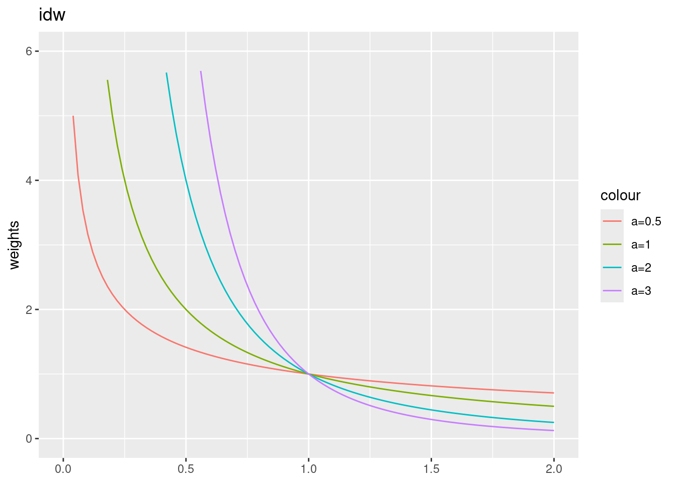
For the exponential decay function, largest weights are fixed to one. Larger power parameters lead to a stronger decay.
ggplot() + xlim(0,20) +
  geom_function(fun = expf, args = list(a=.5), mapping=aes(colour="a=.5")) +
  geom_function(fun = expf, args = list(a=1), mapping=aes(colour="a=1")) +
  geom_function(fun = expf, args = list(a=2), mapping=aes(colour="a=2")) +
  geom_function(fun = expf, args = list(a=3), mapping=aes(colour="a=3")) +
  ylab("weights") + labs(title = "exponential decay")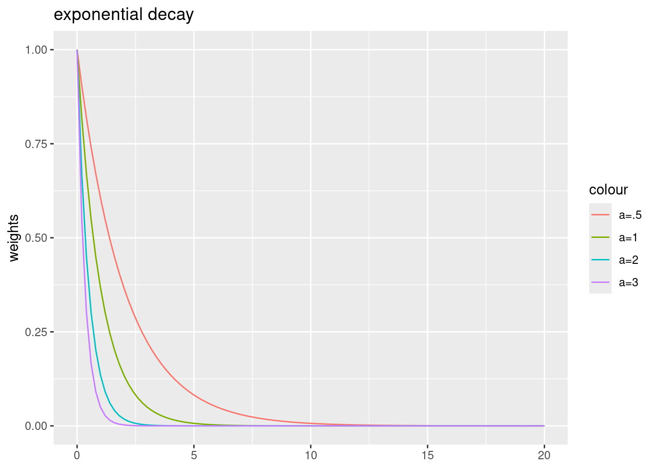
For the double-power distance weights function, largest weights are fixed to one as well. Larger power parameters lead to a weaker decay for short distances and to a stronger decay for longer distances.
dmax = 40
ggplot() + xlim(0,50) +
  geom_function(fun = dpdf, args = list(a=0.5, dmax= dmax),
                mapping=aes(colour="a=0.5")) +
  geom_function(fun = dpdf, args = list(a=1, dmax= dmax),
                mapping=aes(colour="a=1")) +
  geom_function(fun = dpdf, args = list(a=2, dmax= dmax),
                mapping=aes(colour="a=2")) +
  geom_function(fun = dpdf, args = list(a=3, dmax= dmax),
                mapping=aes(colour="a=3")) +
  geom_function(fun = dpdf, args = list(a=4, dmax= dmax),
                mapping=aes(colour="a=4")) +
  ylab("weights") +
  labs(title = "double-power distance weights", subtitle = "dmax = 4")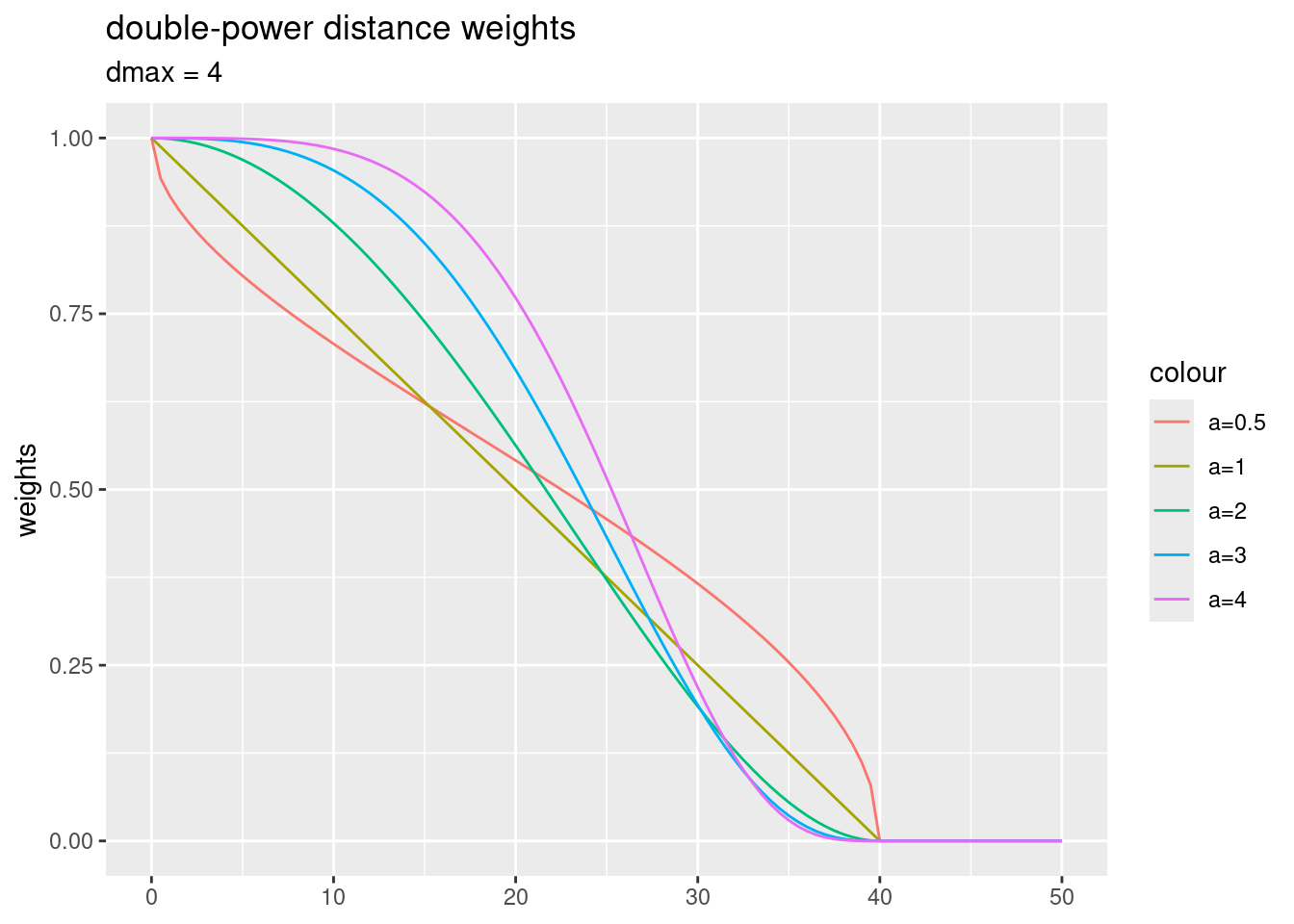
Hint: One has to be careful when setting the parameters, as the function might lead to many zero weights for distances measured in meters due to numerical inaccuracies. So it is good practice to check the resulting weights before continuing.
As mentioned above, the strength of the relationship can also be specified on other information than euclidian distance, such as movement data, import-export relationships, travel time or other accessibility information, Central Place Theory or information on the strength of economic or social networks.
Reasons for choosing a specific distance-decay function could be based an theoretical grounds (e.g. based on interaction or gravity models), empirical grounds (i.e. using the type and parametrization what bests fits the observations based on a criterion such as AIC) or topological. Topological considerations could involve for example for polygons the number of common neighbors, the length of a common edge or the area of a common perimeter. For a deeper discussion on the matter see (Getis, 2009). Empirical approaches to estimate the spatial weight matrix can be based on a semivariogram (cf. the chapter on kriging fitted to the data or a local indicators of spatial association (see (Getis and Aldstadt, 2004)). There are also approaches that try to model the spatial weight matrix by means of bayesian approaches (e.g. Lee and Mitchell, 2012). This, however, involves modelling of a really large set of parameters, even for a decently sized number of spatial units as the elements of the weight matrix grows quadratic with the number of spatial units.
6.2.4 Creation of the weight matrix W by standardizing neighborhood weights
In an additional step we need to create the weight matrix \(W\) from the (potentially distance weighted) neighborhood matrix \(C\). In R \(W\) is represented as a weighted list. The following options exist:
- B is the basic binary coding (1 if two spatial units are considered neighbors and zero otherwise)
- W is row standardised (weights sums over all links to n)
- C is globally standardised (weights sums over all links to n)
- U is equal to C divided by the number of neighboors (weights sums over all links to unity)
- S is the variance-stabilizing coding scheme proposed by (Tiefelsdorf et al., 1999), p. 167-168 (weights sums over all links to n).
For most situations row standardized coding is recommended. It ensures that the weights of all neighbors sum up to unity which is a useful property. The weighted sum of a lagged attribute (predictor or response) is thereby simply the weighted mean - put differently, row standardized coding puts equal weight on each observation (but not link). If binary coding would be used this would not be the case and observations with more neighbors would get more weights compared to observations with less neighbors. A global standardization of W - i.e. normalizing by the sum across all elements in the spatial weight matrix - would put too much emphasis on spatial units with many neighbors. The variance-stabaliuzing coding by (Tiefelsdorf et al., 1999) represents a compromise between th W and the C coding scheme that is sometimes beneficial. An argument by (Tiefelsdorf et al., 1999) is that spatial units at the boundary of the region of interest tend to have a lower number of neighbors than they should have
6.2.5 Implication of spatial units with empty neighboorhood list
If zero policy is set to TRUE, weights vectors of zero length are inserted for regions without neighbor in the neighbors list. These will in turn generate lag values of zero. The spatially lagged value of x for the zero-neighbor region will then be zero, which may (or may not) be a sensible choice.
6.2.6 Rules of thumb for specifying W
Each data set is different and aims of the spatial analysis differ - therefore, it is hard to come up with general rules. Still it is worth to have a look at the experience by the research community - however, it is important not to blindly follow approaches suggested by others but to carefully think about how to model spatial relationships for the analysis at hands. Refereing to a famous statement by Box, all models are wrong but some might be useful - it is up to you to decide about the usefulness of a specific model.
(Griffith, 2020) compiled a list of five rules of thumb to aid the specification of a model for W1:
- “It is better to posit some reasonable geographic weights matrix than to assume independence.”This implies that one should search for or theorize about an appropriate W and that better results are obtained when distance is taken into account.
- “It is best to use surface partitioning that falls somewhere between a regular square and a regular hexagonal tessellation.” Something between four and six neighbors is better than more or less according to that rule.
- “A relatively large number of spatial units should be employed, n > 60.” This rules originates from the law of large numbers. Especially for unequally sized spatial units we require fairly large samples.
- “Low-order spatial models should be given preference over higher-order ones.” This rule refers to the scientific principle of parsimony.
- “In general, it is better to apply a somewhat under-specified (fewer neighbors) rather than an over-specified (extra neighbors) weights matrix.” Overspecification tends to reduces power of the analysis.
6.3 The COVID-19 data case study
We will use the covid-19 cases reported by the RKI as our example data set. The data is aggregated at the level of the districts (in German Kreise) and summed up from the beginning of the pandemic till the 28th of April 2022. The data is stored in a geopackage - like most spatial data formats this file format can be directly read with sf functionality.
## Reading layer `kreiseWithCovidMeldeWeeklyCleaned' from data source
##   `/home/slautenbach/Documents/lehre/HD/git_areas/spatial_data_science/spatial-data-science/data/covidKreise.gpkg'
##   using driver `GPKG'
## Simple feature collection with 400 features and 145 fields
## Geometry type: MULTIPOLYGON
## Dimension:     XY
## Bounding box:  xmin: 280371.1 ymin: 5235856 xmax: 921292.4 ymax: 6101444
## Projected CRS: ETRS89 / UTM zone 32N## [1] "RS_0" "EWZ"
## [3] "GEN" "GF"
## [5] "BEZ" "ADE"
## [7] "BSG" "ARS"
## [9] "AGS" "SDV_ARS"
## [11] "ARS_0" "AGS_0"
## [13] "RS" "IdLandkreis"
## [15] "casesWeek_2020_01_02" "casesWeek_2020_01_23"
## [17] "casesWeek_2022_04_27" "sumCasesTotal"
## [19] "incidenceTotal" "Langzeitarbeitslosenquote"
## [21] "Hochqualifizierte" "Breitbandversorgung"
## [23] "Stimmenanteile.AfD" "Studierende"
## [25] "Einpendler" "Auspendler"
## [27] "Auslaenderanteil" "Laendlichkeit"
## [29] "geom"The important fields are as follows:
- sumCasesTotal the total number of cases in that district
- EWZ - the number of inhabitants
- incidenceTotal: sumCasesTotal / EWZ
- GEN - name of the district
Let’s plot the data:
tm_shape(covidKreise) + tm_polygons(col="incidenceTotal",   legend.hist = TRUE, palette= "-plasma",
                         legend.reverse = TRUE, title = "Incidence rate") +
  tm_layout(legend.outside = TRUE, bg.color = "darkgrey", outer.bg.color = "lightgrey",
            legend.outside.size = 0.5, attr.outside = TRUE, title = "COVID-19 incidence rate till 28th of April 2022",
            legend.outside.position = "left") + tm_scale_bar()
## ## ── tmap v3 code detected ───────────────────────────────────────────────────────## [v3->v4] `tm_tm_polygons()`: migrate the argument(s) related to the scale of
## the visual variable `fill` namely 'palette' (rename to 'values') to fill.scale
## = tm_scale(<HERE>).
## [v3->v4] `tm_polygons()`: use 'fill' for the fill color of polygons/symbols
## (instead of 'col'), and 'col' for the outlines (instead of 'border.col').
## [v3->v4] `tm_polygons()`: migrate the argument(s) related to the legend of the
## visual variable `fill` namely 'title', 'legend.reverse' (rename to 'reverse')
## to 'fill.legend = tm_legend(<HERE>)'
## [v3->v4] `tm_polygons()`: use `fill.chart = tm_chart_histogram()` instead of
## `legend.hist = TRUE`.
## [v3->v4] `tm_layout()`: use `tm_title()` instead of `tm_layout(title = )`
## ! `tm_scale_bar()` is deprecated. Please use `tm_scalebar()` instead.
## [plot mode] fit legend/component: Some legend items or map compoments do not
## fit well, and are therefore rescaled.
## ℹ Set the tmap option `component.autoscale = FALSE` to disable rescaling.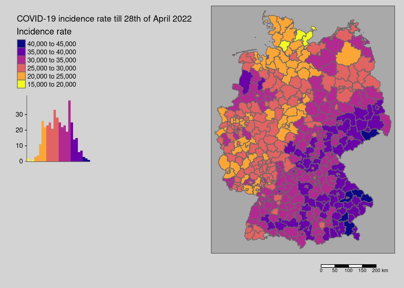
The data seem spatially structured. This is what we would like to investigate here.
6.3.1 Defining neighbors and the spatial weight matrix W
For the data at hands a definition of neighborhood is not as obvious as for gridded data. Therefore, we are going to explore a number of different possibilities and discuss them shortly.
6.3.1.1 Demonstration of different neighborhood definitions
6.3.1.1.1 Distance based neighborhood definition
We start with a distance based neighborhood definition. We could use the centroid of the districts (st_centroid(covidKreise, of_largest_polygon=TRUE)) but this might be problematic if we have districts that contain other districts (e.g. Landkreis and Stadtkreis Heilbron) - it might be that the centrod is located outside of the polygon which would be problematic. Therefore, we use st_point_on_surface (see the material from Einführung in die Geoinformatik), which returns a point that is guaranteed to be located inside the district.
A distance of 70km might be a good start to define neighboring districts. The parameters d1 and d2 define the minimum and the maximum distance (in map units) for which a point is considered a neighbor of another point.
## Warning: st_point_on_surface assumes attributes are constant over geometriesHow many neighbors have the different districts? We use card to get the number of neighbors from the neighbor list and table to aggregate the information:
##
##  2  4  5  6  7  8  9 10 11 12 13 14 15 16 17 18 19 20 21 22 23 24 25 26 27 28
##  4  5  6  6 11 11 17 13 13 16 29 24 24 12 18 26 22 15 19 10 12  9  8  8  6  5
## 29 30 31 32 33 34 35 36 37
##  6  8  7  6  9  4  7  2  2
If we want it more visual we could simply use card as input for a histogram plot.
as.data.frame(table(card(distnb))) %>%
  ggplot(aes(x=Var1, y=Freq)) +
  geom_col() + xlab("Number of neighbors")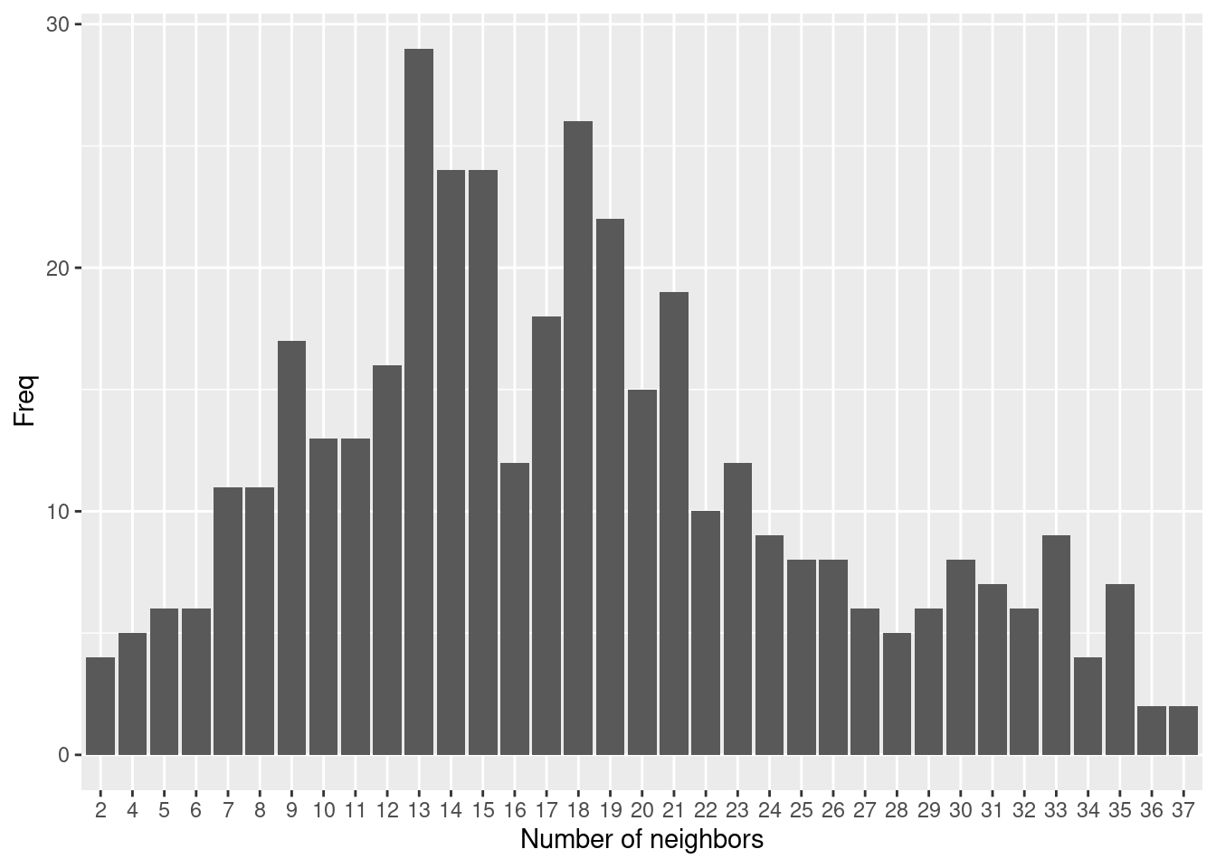
We can also plot the links between centroids in space.
plot(st_geometry(covidKreise), border = "grey60", reset = FALSE)
plot(distnb, coords=st_coordinates(poSurfKreise), col="red",  cex=.7, add=TRUE)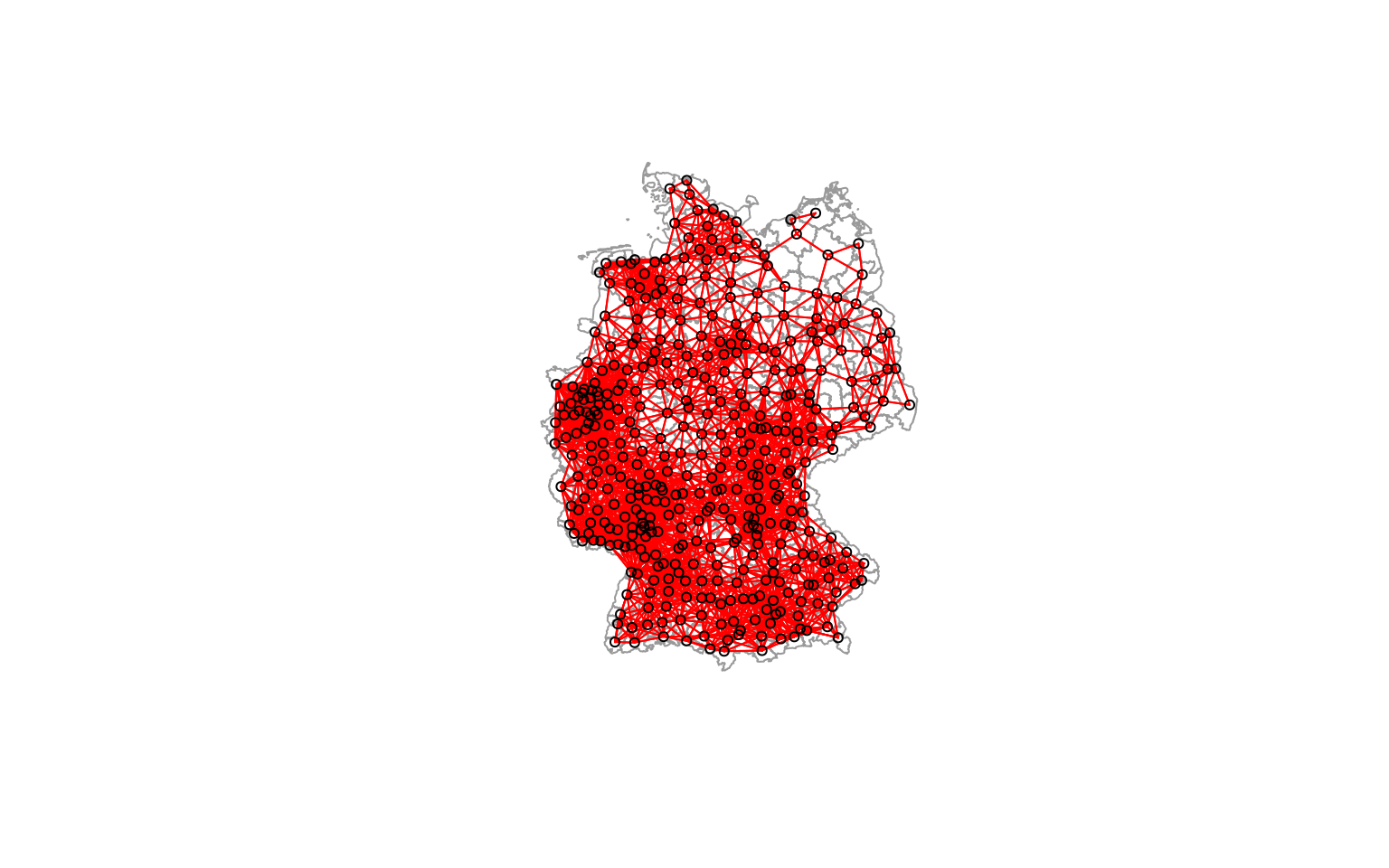
As we see some districts have much more neighbors than others due to the size of the districts. As the size of the districts somewaht corresponds with the population size we have more neighbors in more densely populated areas such as the Ruhrgebiet, the Rhein-Main or the Rhein-Neckar region.
6.3.1.1.2 Contiguity based neighborhood definition
Another way of defining neighborhood for polygon data is based on edges (or nodes) shared between polygons. If two polygons share an edge/line segement (rook adjacency) or a node (queen adjacency) they are considered neighbors.
##
##  1  2  3  4  5  6  7  8  9 10 11 12
## 27 26 44 47 60 74 68 30 15  6  2  1
The number of neighbors is distributed more evenly and with a narrower range compared to the 70km distance based neighborhood definition.
as.data.frame(table(card(polynb))) %>%
  ggplot(aes(x=Var1, y=Freq)) +
  geom_col() + xlab("Number of neighbors")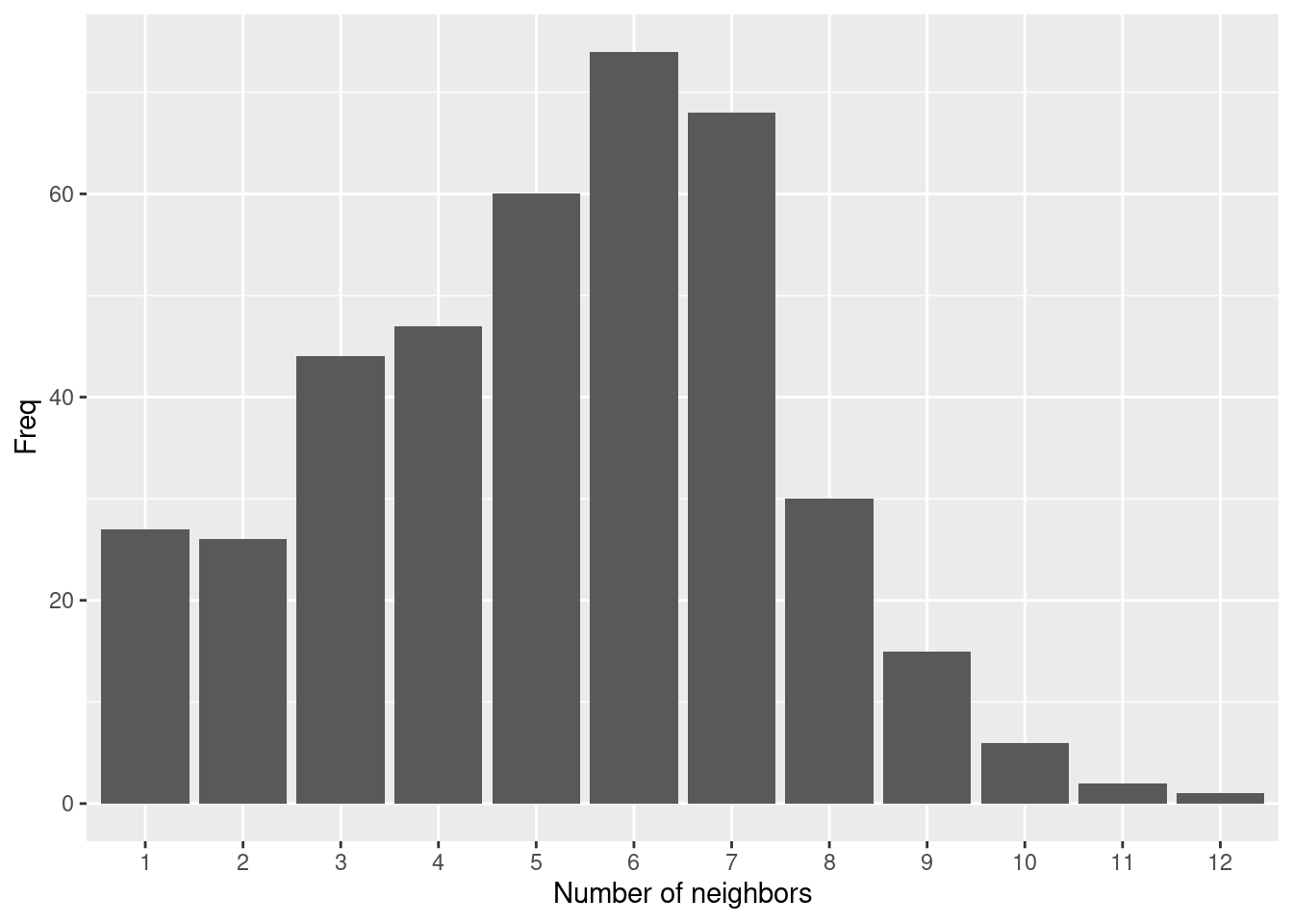
plot(st_geometry(covidKreise), border = "grey60", reset = FALSE)
plot(polynb, coords=st_coordinates(poSurfKreise), col="red",  cex=.7, add=TRUE)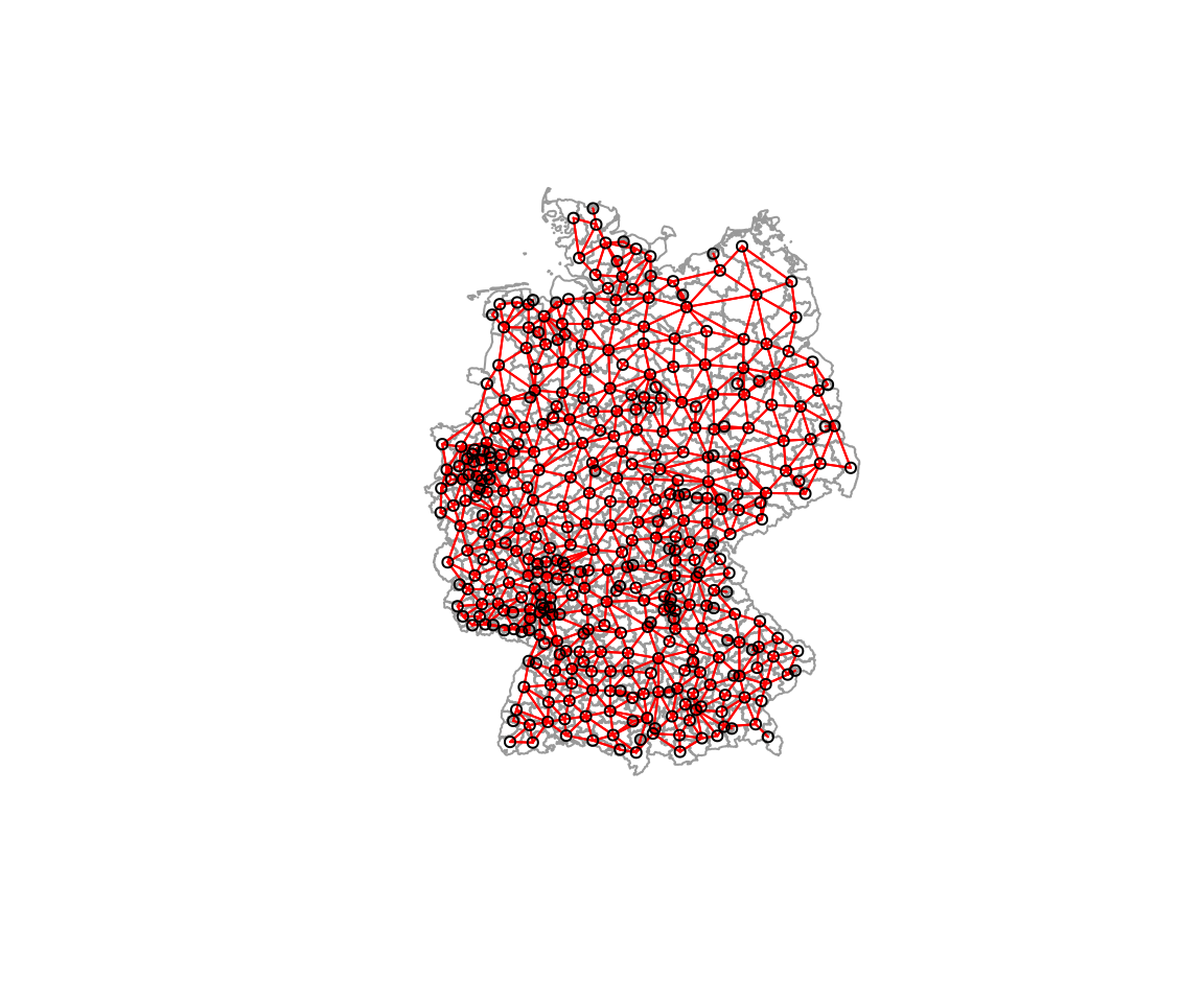
Still the more densely populated areas with smaller districts have more neighbors. However, less severely skewed compared to before.
6.3.1.1.3 10-nearest neighbors
As an alternative we could use the 10 nearest neighbors (or nay other number of neighbors). To create such a neighbor list, we need to combine two functions: knearneigh to get the nearest neighbors and knn2nb to convert this into a neighborhood list.
##
##  10
## 400
Not unexpectedly, every district has 10 neighbors.
plot(st_geometry(covidKreise), border = "grey60", reset = FALSE)
plot(k10nb, coords=st_coordinates(poSurfKreise), col="red",  cex=.7, add=TRUE)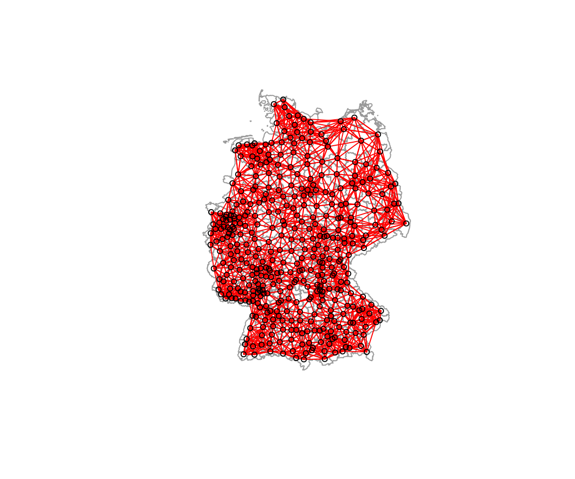
Some districts now call relatively far away districts neighbors. And importantly, the neighbor list is not symmetric.
## [1] FALSEIf required, we could make this neighborhood list symetric by make.sym.nb. This completes the list and thereby of course leads a shift in the number of neighbors for the individual districts. The function returns a new neighborhood definition, i.e. it does not work on the existing neighborhood object.
##
##  10  11  12  13  14  15  16  17
## 113 110  72  47  38  12   5   3
6.3.1.1.4 Graph based neighborhoods
A couple of further approaches exist that define neighborhoods on some geometrical property:
- Delaunay triangulation: all nodes connected for which the circumcise around three points ABC contains no other nodes
- Gabriel graph: all nodes connected if were is no other node inside a circle with their distance
- \(d(x,y) \leq min(\sqrt{d(x,z)^2 + d(y,z)^2)}|z \epsilon S)\)
- Relative neighborhood graph: all nodes connected for those the lens formed by the radii of their circles contains no other points
- two points are neighbors whenever there is no third point closer to both of them than they are to each other
- i.e. \(d(x,y) \leq min(max(d(x,z), d(y,z))|z \epsilon S)\), \(d()\) distance, \(S\) set of points, \(x\) and \(y\) the points tested, \(z\) an arbitrary third point
- Sphere of interest:
- for a set of points draw a circle around each point, using the distance to the closest neighbor as the radius
- if two of those circles intersect, they are considered neighbors
- Minimum spanning tree: connects all nodes together while minimizing total edge length
The Gabriel graph is a subgraph of the delaunay triangulation and has the relative neighbor graph as a sub-graph.
In the following I show a few figures (Figures 6.1, 6.3, 6.5, 6.7) that show how the different graph based neighborhood definitions work on a smallish and relatively regular point pattern.
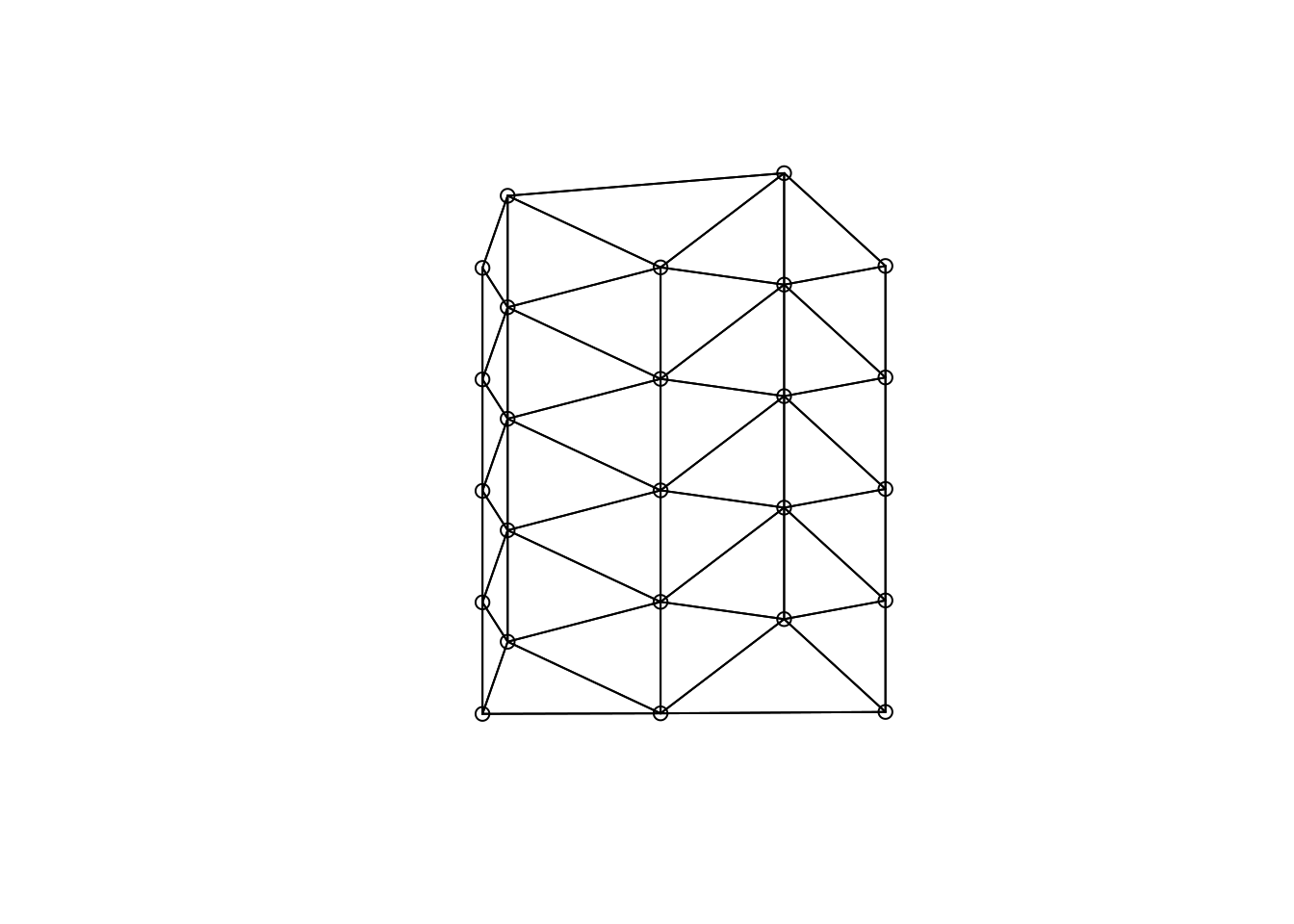
Figure 6.1: Delauny triangulation as an example of a graph base neighborhood definition
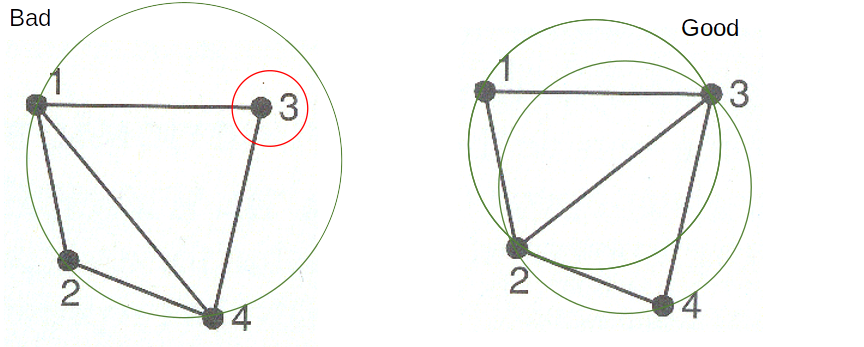
Figure 6.2: Delauny triangulation based neighborhood. Decision rules
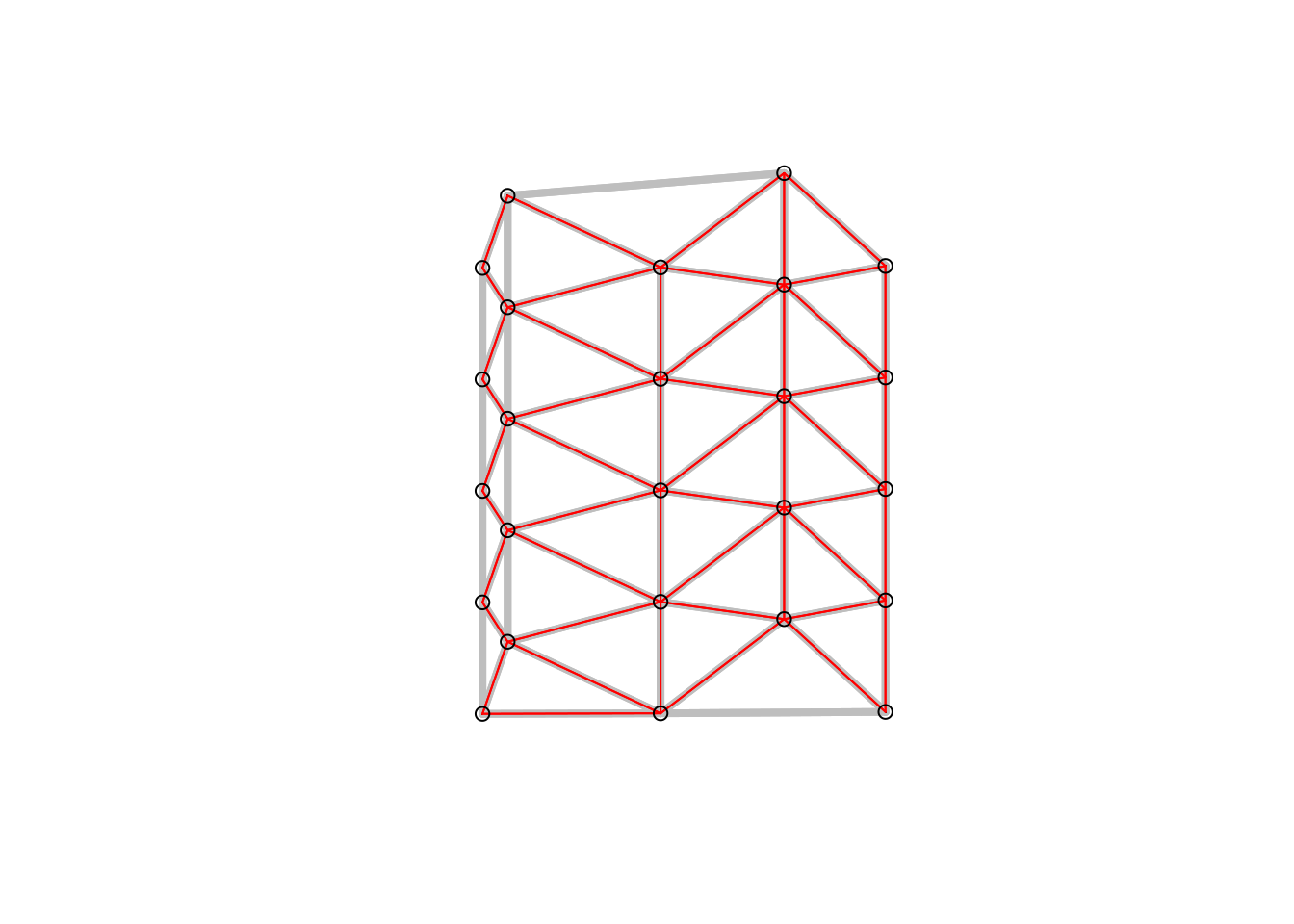
Figure 6.3: Gabriel graph (red) and Delauny triangulation in the background (grey). All nodes connected if were is no other node inside a circle with their distance.
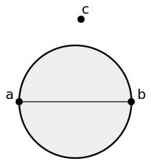
Figure 6.4: Gabriel graph neighborhood. Decision rules
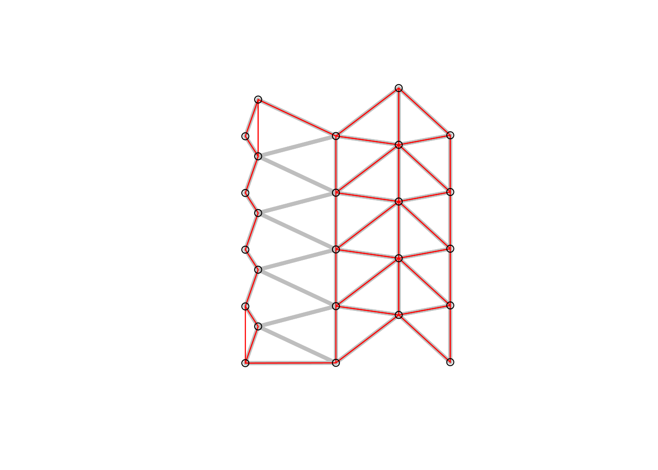
Figure 6.5: Sphere of interest (red) and gabriel graph in the background.
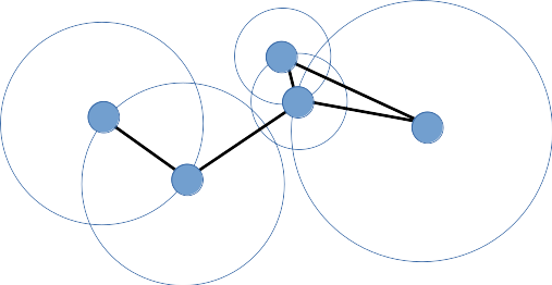
Figure 6.6: Sphere of interest graph. Decision rules
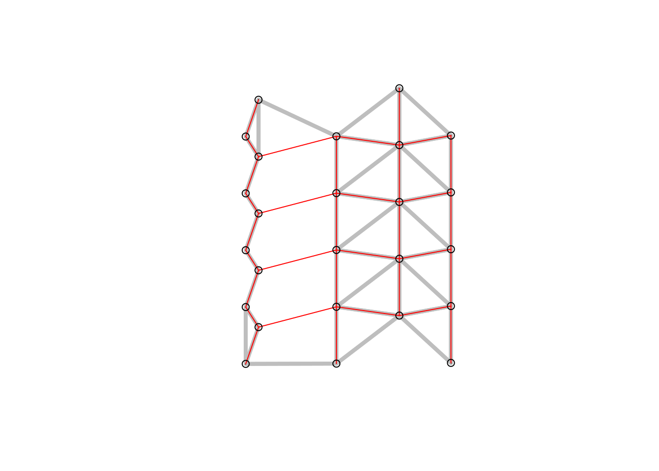
Figure 6.7: Relative neighbor graph (red) and sphere of interest in the background. Two points are neighbors whenever there is no third point closer to both of them than they are to each other.
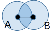
Figure 6.8: Relative neighbor graph. Decision rules
Graph based neighborhoods can be defined as follows, using a set of points as a starting point. For polygon data these points can be derived by using sf::st_point_on_surface or sf::st_centroids.
# delauny triangulation
delauny_nb <- tri2nb(st_coordinates(poSurfKreise) )
# sphere of influence
soi_nb <- graph2nb(soi.graph(delauny_nb, st_coordinates(poSurfKreise)))
# gabriel graph
gabriel_nb <- graph2nb(gabrielneigh(st_coordinates(poSurfKreise)))
# relative graph
rg_nb <- graph2nb(relativeneigh(st_coordinates(poSurfKreise)))
The distribution of the number of neighbors has a relatively small range. Pleae note tha both the gebriel graph and the relative graph lead to a large number of districts without a neighbor which makes them not suitable for the dataset.
##
##   4   5   6   7   8   9
## 36 114 134 90 22 4##
## 1 2 3 4 5 6 7 8 9
## 6 25 66 94 103 66 34 5 1##
## 0 1 2 3 4 5 6
## 58 86 93 81 53 20 9##
## 0 1 2 3 4
## 100 122 110 59 9The Delauny triangulation leads to some neighborhood relationships that seem not really useful.
plot(st_geometry(covidKreise), border = "grey60", reset = FALSE)
plot(delauny_nb, coords=st_coordinates(poSurfKreise), col="red",  cex=.7, add=TRUE )
mtext("Delauny Triangulation")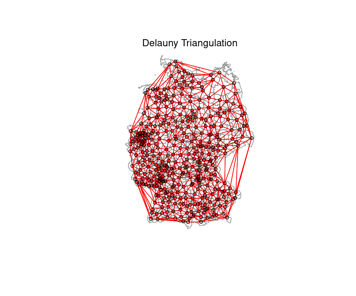
plot(st_geometry(covidKreise), border = "grey60", reset = FALSE)
plot(soi_nb, coords=st_coordinates(poSurfKreise), col="red",  cex=.7, add=TRUE )
mtext("Sphere of influence")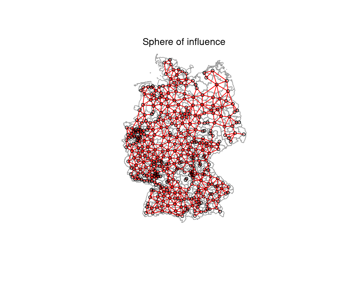
plot(st_geometry(covidKreise), border = "grey60", reset = FALSE)
plot(gabriel_nb, coords=st_coordinates(poSurfKreise), col="red",  cex=.7, add=TRUE )
mtext("Gabriel graph")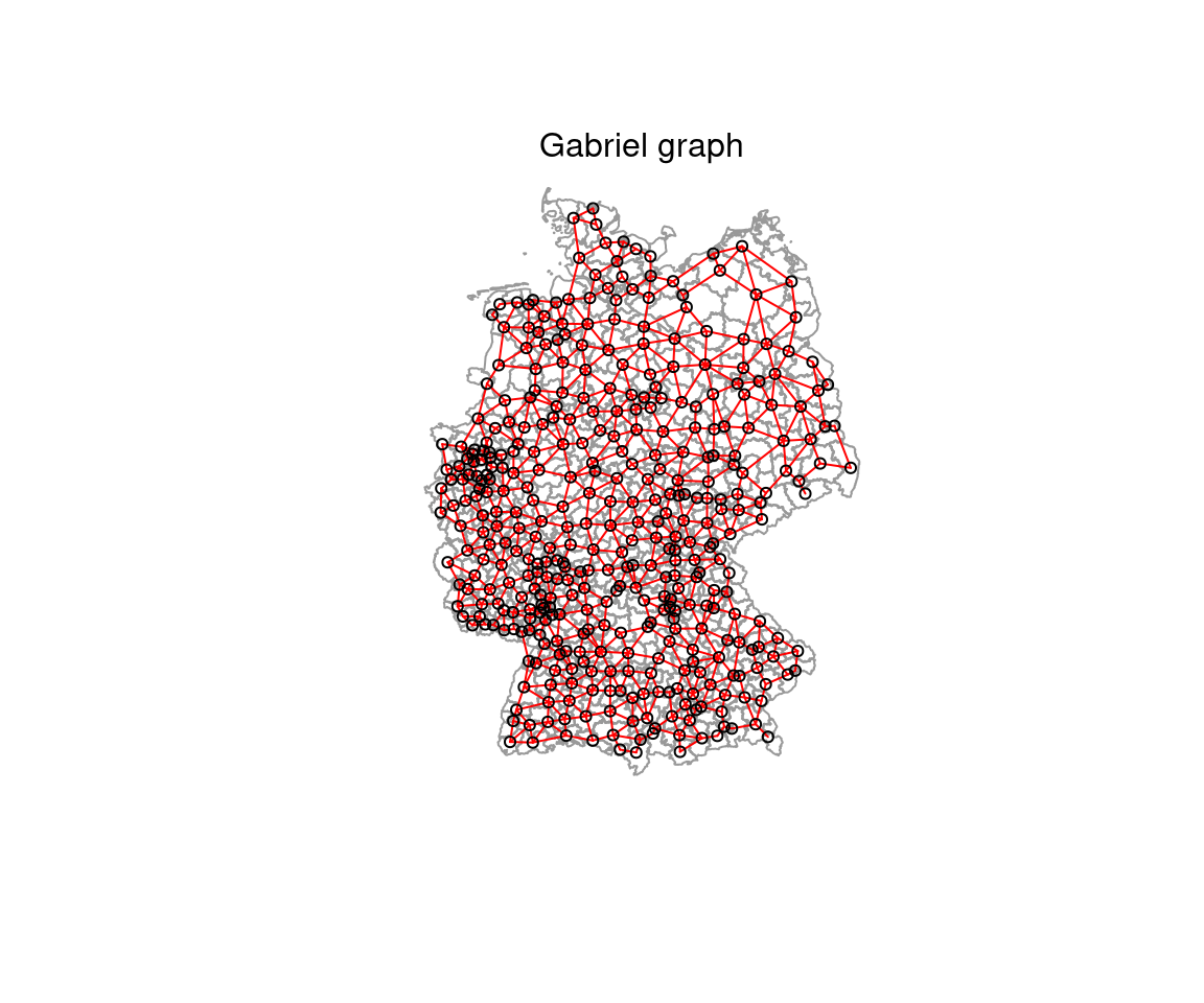
plot(st_geometry(covidKreise), border = "grey60", reset = FALSE)
plot(rg_nb, coords=st_coordinates(poSurfKreise), col="red",  cex=.7, add=TRUE )
mtext("Relative graph")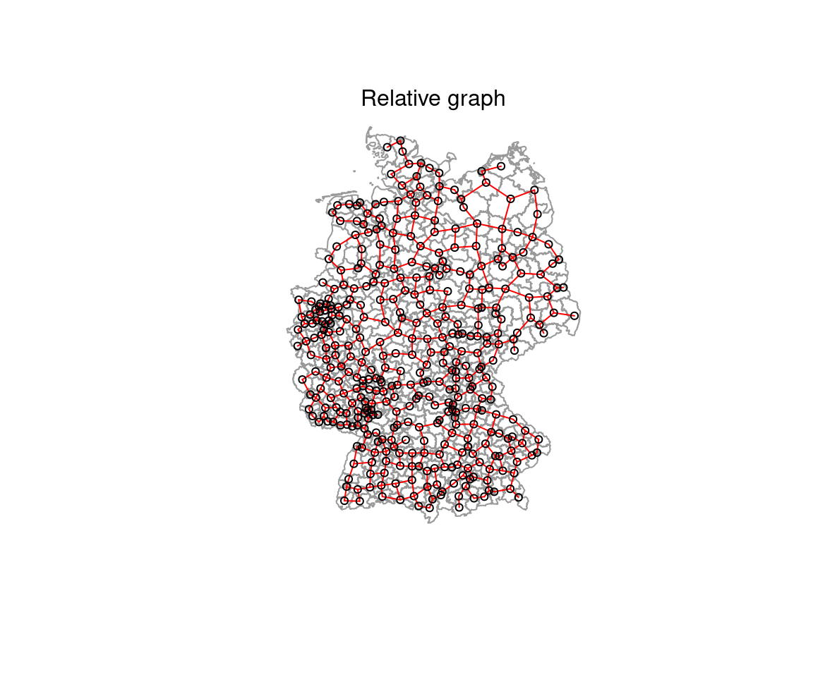
6.3.1.1.5 Combination of contiguity and distance based neighborhood definitions
For the following analysis we will be using a combination of the contiguity and the distance based neighborhood definition.
##
##  2  3  4  5  6  7  8  9 10 11 12 13 14 15 16 17 18 19 20 21 22 23 24 25 26 27
##  2  1  4  6  5 13  9 18 14 12 17 30 23 23 13 16 28 22 16 19 10 12  9  7  9  6
## 28 29 30 31 32 33 34 35 36 37
## 5 6 8 7 6 9 4 7 2 2plot(st_geometry(covidKreise), border = "grey60", reset = FALSE)
plot(unionedNb, coords=st_coordinates(poSurfKreise), col="red", cex=.7, add=TRUE)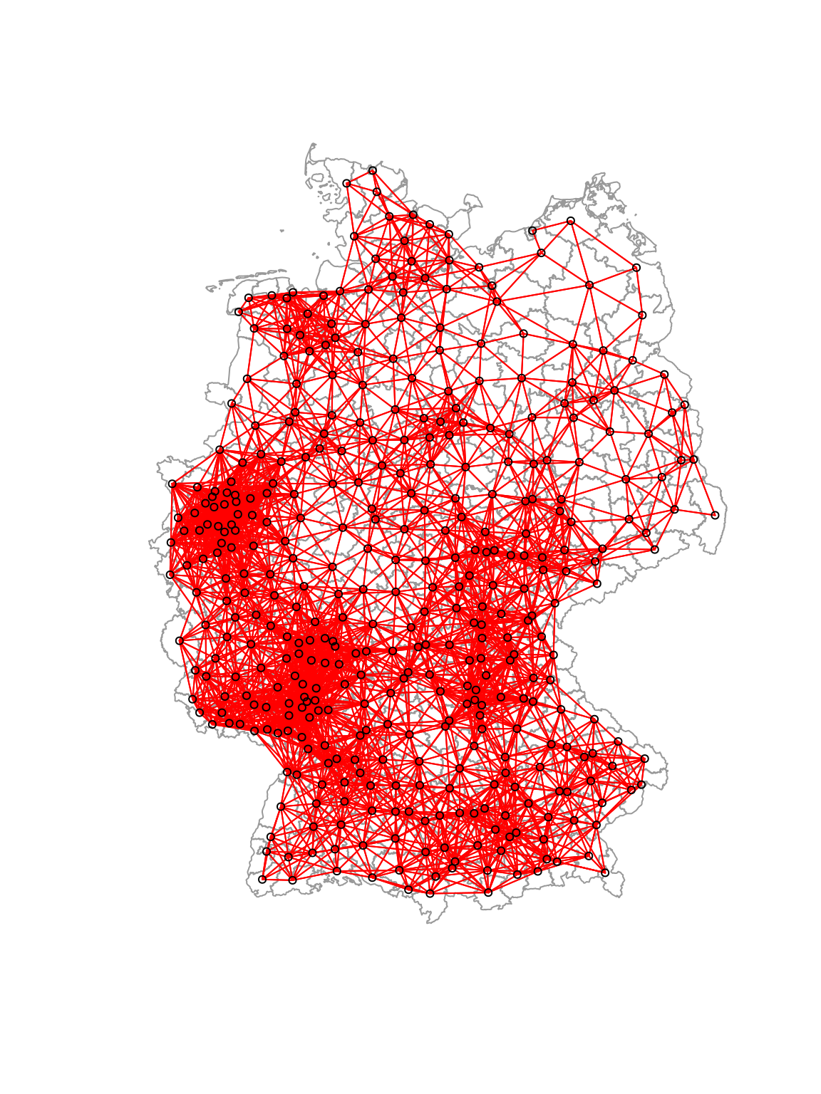
6.3.2 Inverse distance based weighting of neighbors
We will consider the different distances between the point on surface by an inverse distance relationship. Note that that we row standardize the weights afterwards.
nbdists(nb, coords) calculates the euclidian distances between all pairs of neighbors based on the point coordinates provided. The lapply command maps a function to the resulting distance list. Here the function simply is 1/x - i.e. we simply calculate the inverse of each distance. The resulting weights are when used for the glist argument in nb2listw which creates the row-standardized (style="W")) weight matrix W.
dlist <- nbdists(unionedNb, st_coordinates(poSurfKreise))
dlist <- lapply(dlist, function(x) 1/x)
unionedListw_d <- nb2listw(unionedNb, glist=dlist, style = "W")
For plotting in a histogram we need to extract the weights, unlist them and store them in a data frame first. The weights are stored in the weights slot of the weighted list object. unlist unlists them into an vector which we use as a column in a data.frame which can be used with ggplot.
data.frame(weights=unlist(unionedListw_d$weights)) %>%
  ggplot(mapping= aes(x= weights)) +
  geom_histogram() +
  labs(title="Weight matrix" , subtitle = "unioned contiguity and 50km distance nb, idw p=1, W")
## `stat_bin()` using `bins = 30`. Pick better value with `binwidth`.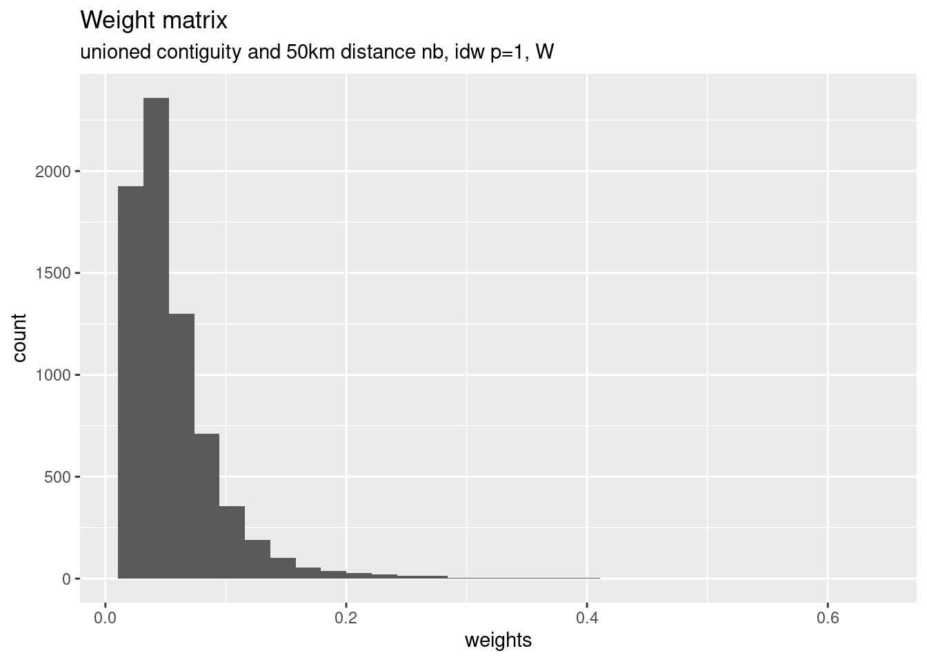
We are of course not limited to use a power of 1 but could as well use higher power values. This puts more weight on closer neighbors.
dlist2 <- nbdists(unionedNb, st_coordinates(poSurfKreise))
dlist2 <- lapply(dlist2, function(x) x^(-2))
unionedListw_d2 <- nb2listw(unionedNb, glist=dlist2, style = "W")
## Warning in nb2listw(unionedNb, glist = dlist2, style = "W"): zero sum general
## weights## Characteristics of weights list object:
## Neighbour list object:
## Number of regions: 400
## Number of nonzero links: 7132
## Percentage nonzero weights: 4.4575
## Average number of links: 17.83
## Link number distribution:
##
## 2 3 4 5 6 7 8 9 10 11 12 13 14 15 16 17 18 19 20 21 22 23 24 25 26 27
## 2 1 4 6 5 13 9 18 14 12 17 30 23 23 13 16 28 22 16 19 10 12 9 7 9 6
## 28 29 30 31 32 33 34 35 36 37
## 5 6 8 7 6 9 4 7 2 2
## 2 least connected regions:
## 345 360 with 2 links
## 2 most connected regions:
## 160 198 with 37 links
##
## Weights style: W
## Weights constants summary:
## n nn S0 S1 S2
## W 400 160000 400 120.4916 1628.03hist(unlist(unionedListw_d2$weights), las=1, xlab="weights", main="unioned contiguity and 50km distance nb, idw p=2, W")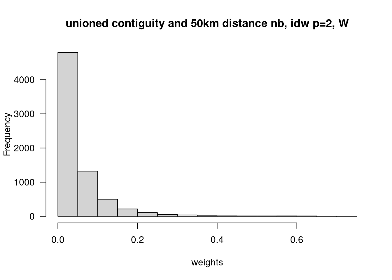
6.3.3 Spatial smoothing
As soon as we have the row-standardized spatial weight Matrix \(W^*\) we can use it for operations that involve neighborhood relationships. One easy thing is spatial smoothing there we calculate the lagged value of a variable, simply by multiplying \(W^*\) with the vector of interest. There are two ways to do it in spdep: converting the weighted list representation to a spatial weight matrix representation by means of listw2mat and using matrix multiplication (%*%) to multiply it with the vector of interest.
or by using the convenience function lag.listw
both result in the same result:
## [1] 0However, the first approach returns a matrix (with 1 column) which we need to cast to a vector first (using as.numeric). Therefore the second approach is easier to use.
We need to spatially smooth the cases and the population at risk separately and then combine them:
covidKreise$sumCasesTotalLag1 <- lag.listw(x= unionedListw_d, var =covidKreise$sumCasesTotal )
covidKreise$EWZLag1 <- lag.listw(x= unionedListw_d, var =covidKreise$EWZ )
covidKreise <- covidKreise %>% mutate(incidenceTotalLag1 = sumCasesTotalLag1 / EWZLag1 * 10^5)
Next we plot those, overlaying a smoother and the 1:1 line.
covidKreise %>%
  ggplot(aes(x=incidenceTotal, y = incidenceTotalLag1)) +
  geom_point(alpha=.5) +
  geom_smooth() +
  geom_abline(slope=1, intercept = 0, lty=2, col="darkgrey") +
  xlab("Incidence rate") + ylab("Incidence rate lagged")
## `geom_smooth()` using method = 'loess' and formula = 'y ~ x'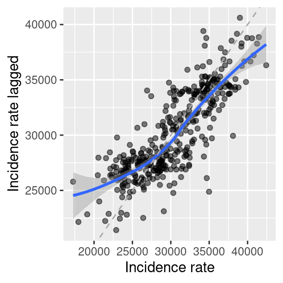
Figure 6.9: COVID-19 incidence rate against the lagged incidence rate (weighted mean of incidence of the neighbors). On top a lowess smoother (moving average, blue) and the 1:1 line have been plotted for guidance.
As we have row standardized the weights we are simply calculating a weighted average of the neighbors (ignoring the district itself as it is not considered a neighbor of itself). We see that for districts with low incidence rates neighboring districts have on average higher values. For districts with high values the weighted mean of the neighbors is mostly lower.
#tmap_mode("plot")
breaks <- seq(15000, 45000, by = 5000)
m1 <- tm_shape(covidKreise) +
  tm_polygons(col="incidenceTotal", breaks = breaks,
            title = "Incidence rate") +
  tm_scale_bar() +
  tm_layout(legend.outside = TRUE, legend.outside.position = "left")
m2 <- tm_shape(covidKreise) +
  tm_polygons(col="incidenceTotalLag1", breaks = breaks,
            title = "Incidence rate,\nlagged") +
  tm_scale_bar() +
  tm_layout(legend.outside = TRUE, legend.outside.position = "right")
tmap_arrange(m1, m2) 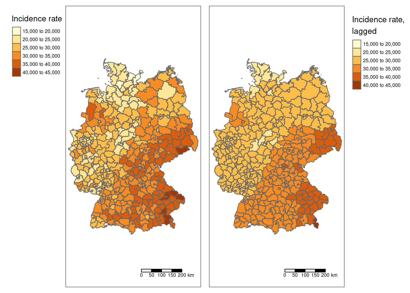
Figure 6.10: COVID-19 incidence rate and lagged incidence rate.
Please not that we have defined breaks for the legend to ensure that the colors in both maps match.
We see that a few districts stand out from the trend (smooth part): the saxony swiss and five districts in Bavaria are higher than the smoothed surface and in the West (e.g. the Ruhrgebiet) and North we see quite some districts that are lower than the smoothed surface. However, the classification necessary for a choroplethe map might trick us.
covidKreise %>%
  mutate(incidenceTotalDiffLag1 = incidenceTotal - incidenceTotalLag1) %>%
 tm_shape() +
  tm_polygons(col="incidenceTotalDiffLag1", palette = "-RdBu",
            title = "Incidence rate - lagged incidence rate", n=7) +
  tm_scale_bar() +
  tm_layout(legend.outside = TRUE, legend.outside.position = "left", attr.outside = TRUE)
## ## ── tmap v3 code detected ───────────────────────────────────────────────────────## [v3->v4] `tm_tm_polygons()`: migrate the argument(s) related to the scale of
## the visual variable `fill` namely 'n', 'palette' (rename to 'values') to
## fill.scale = tm_scale(<HERE>).
## [v3->v4] `tm_polygons()`: migrate the argument(s) related to the legend of the
## visual variable `fill` namely 'title' to 'fill.legend = tm_legend(<HERE>)'
## ! `tm_scale_bar()` is deprecated. Please use `tm_scalebar()` instead.
## Multiple palettes called "rd_bu" found: "brewer.rd_bu", "matplotlib.rd_bu". The first one, "brewer.rd_bu", is returned.
##
## [scale] tm_polygons:() the data variable assigned to 'fill' contains positive and negative values, so midpoint is set to 0. Set 'midpoint = NA' in 'fill.scale = tm_scale_intervals(<HERE>)' to use all visual values (e.g. colors)
##
## [cols4all] color palettes: use palettes from the R package cols4all. Run
## `cols4all::c4a_gui()` to explore them. The old palette name "-RdBu" is named
## "rd_bu" (in long format "brewer.rd_bu")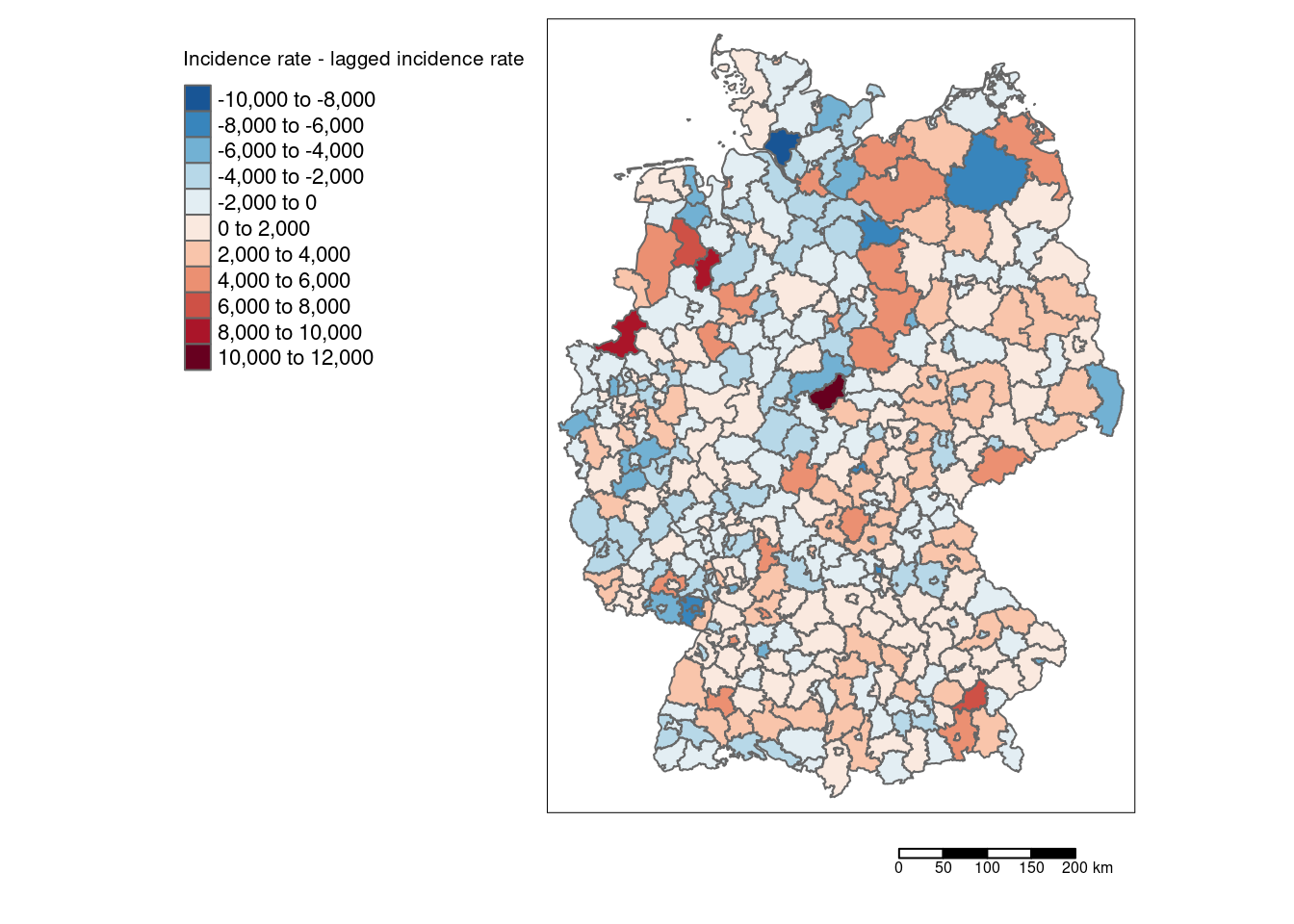
Using the differences between laged and non laged incidence rate provides us with deeper insights about which districts differ most strongly compared to their neighbors.
References
Cited based on (Getis and Aldstadt, 2004)↩︎